Nestlé Brands POS Campaign

Promotional POS Campaign

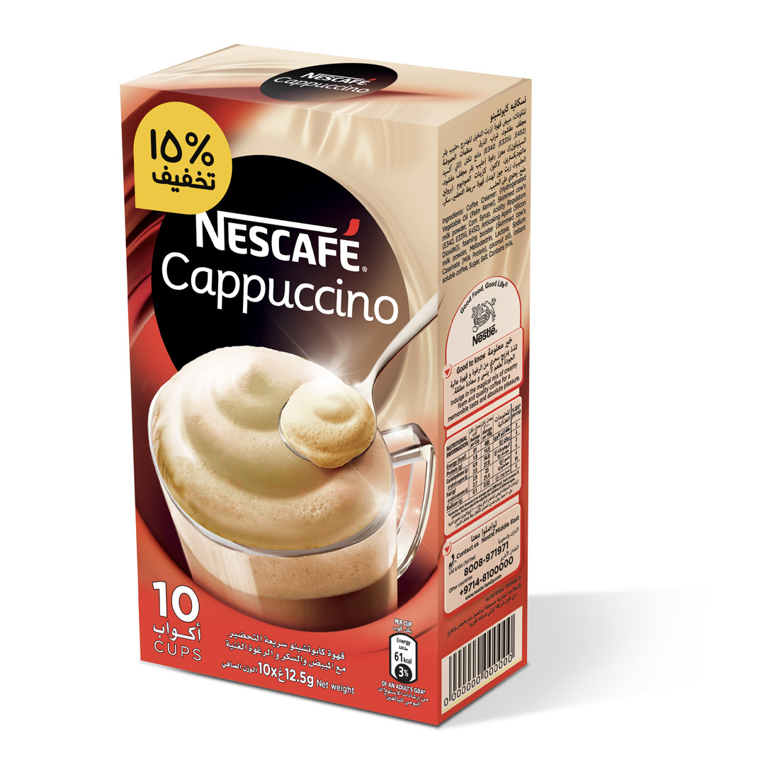
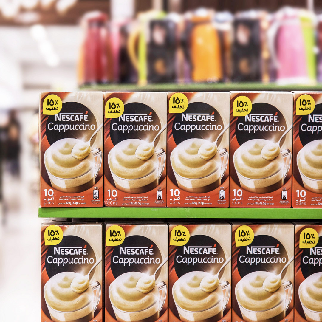
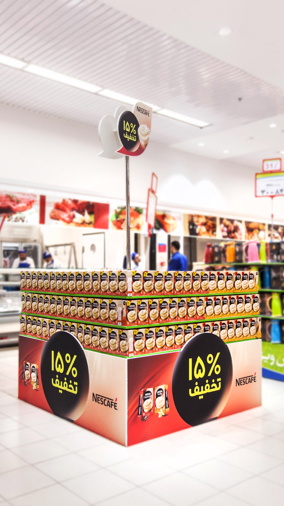
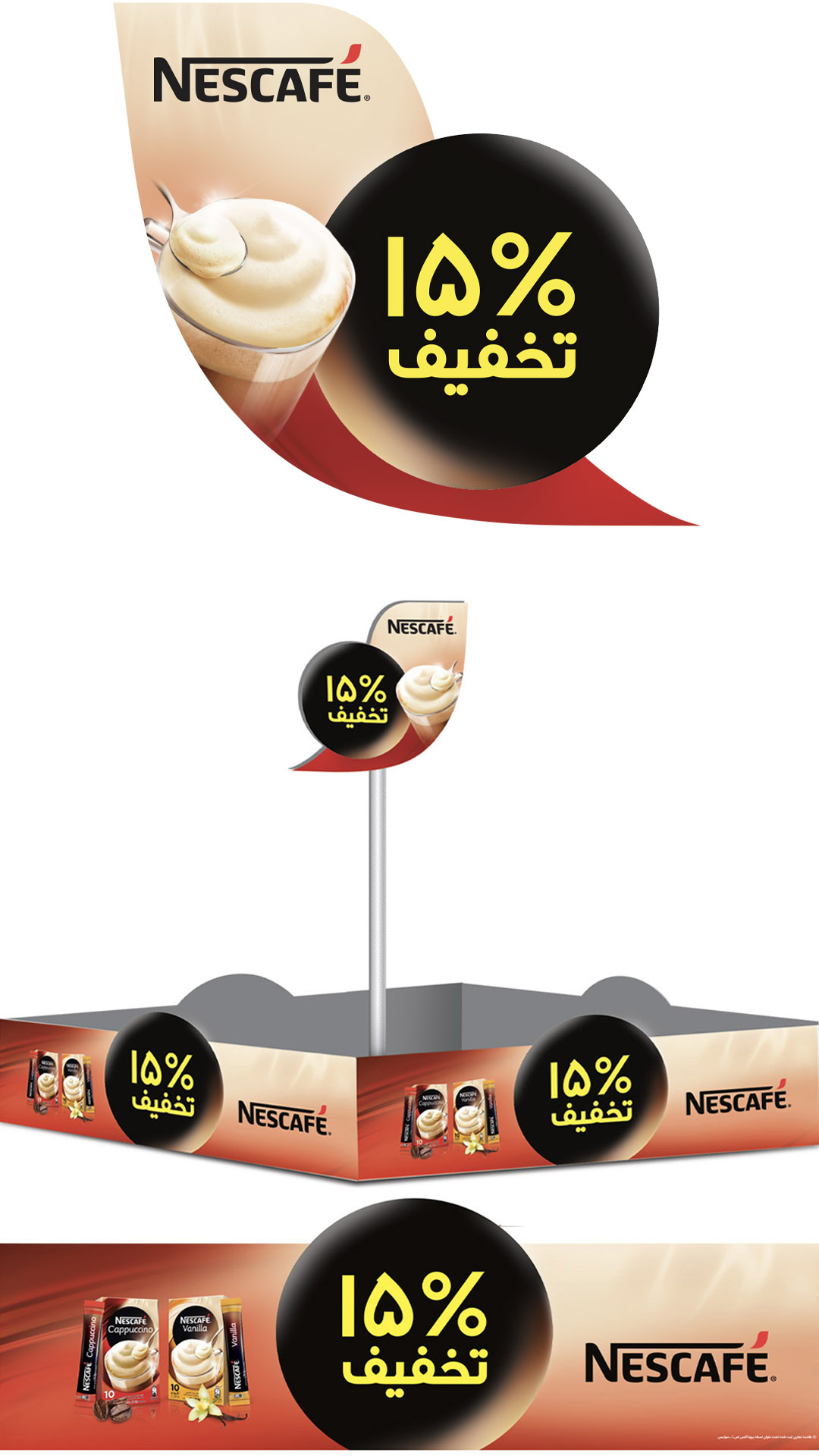
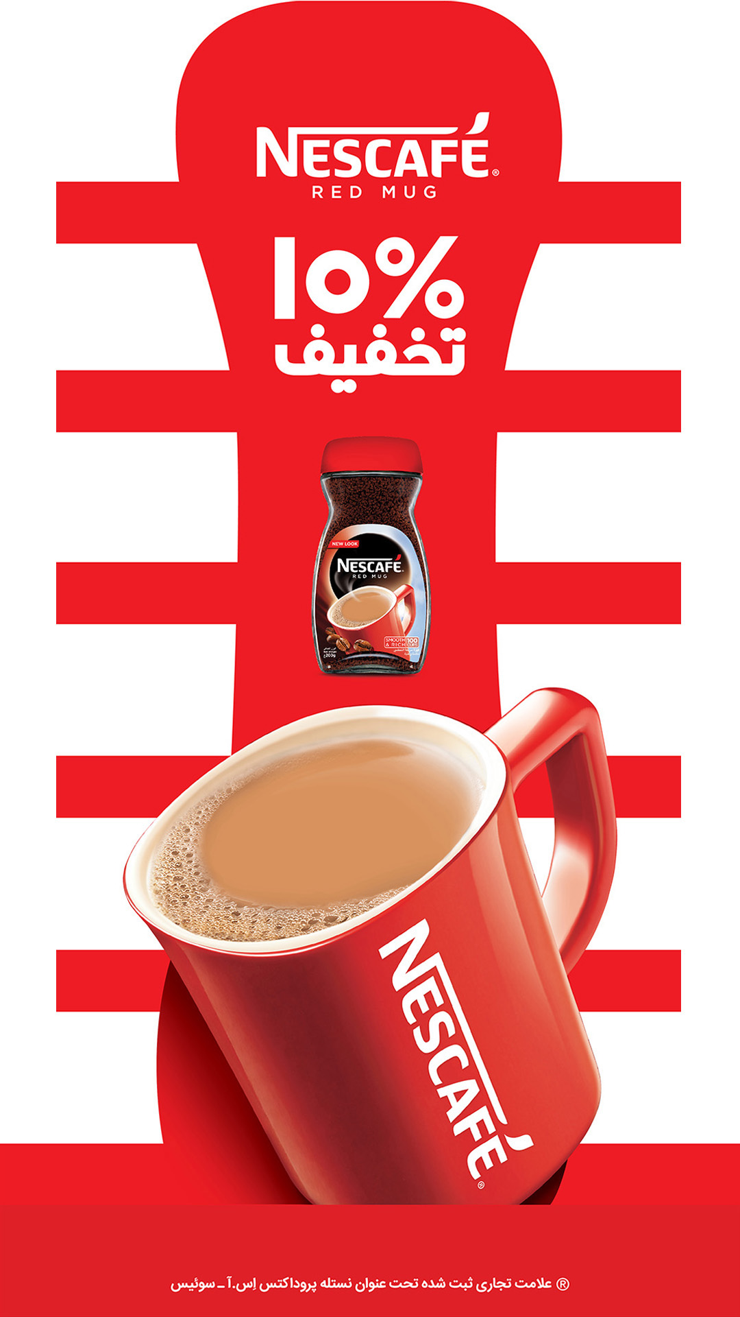
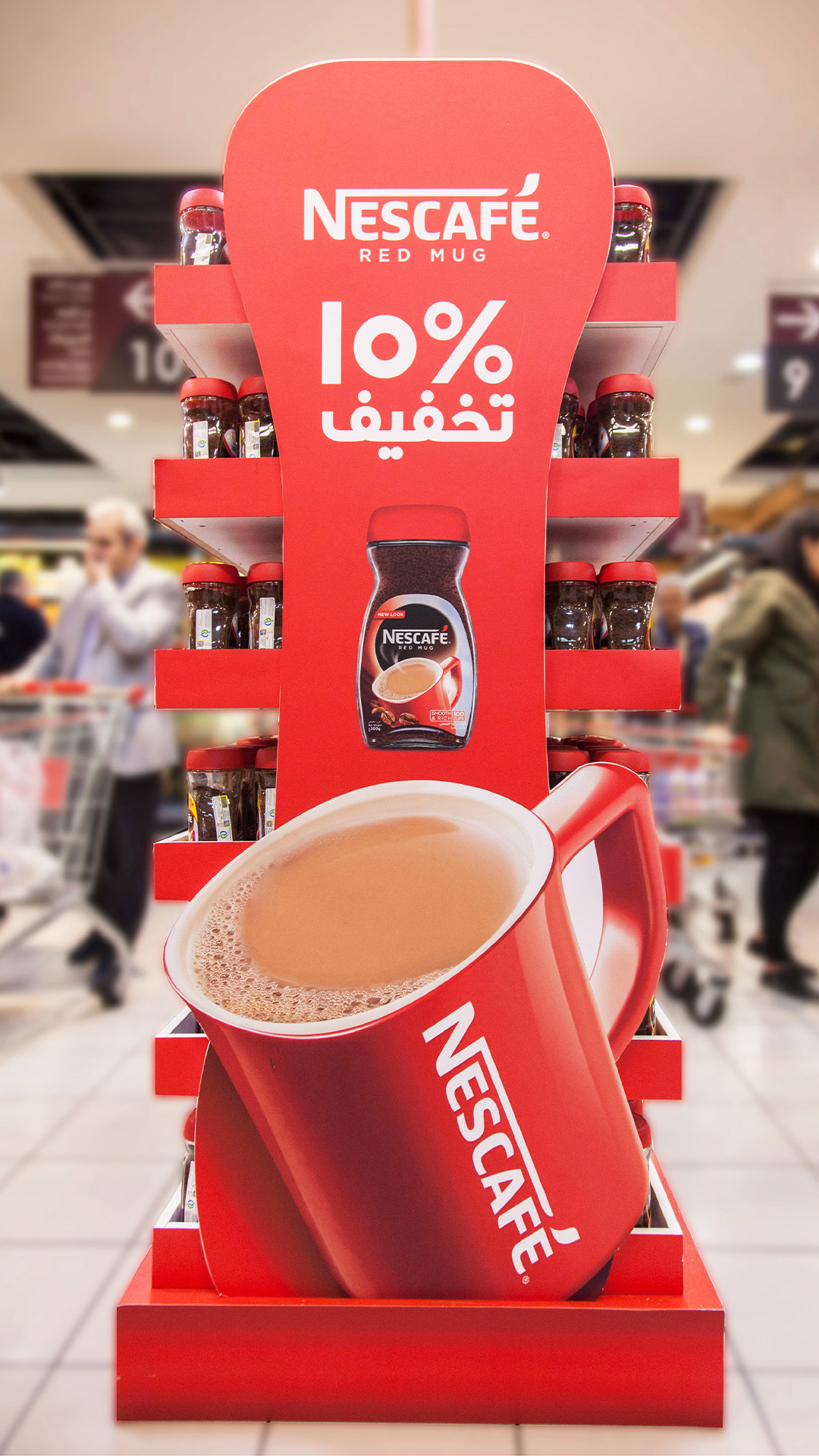
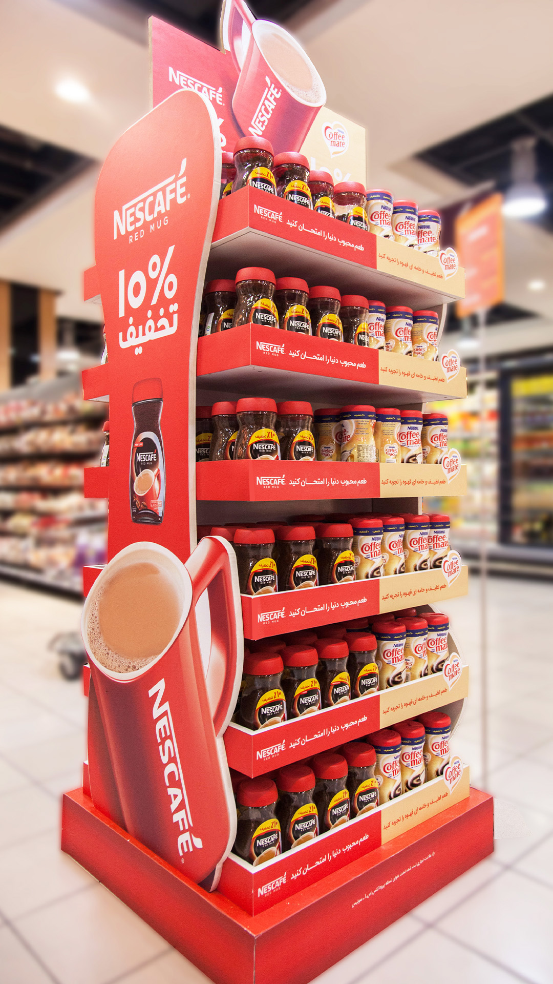
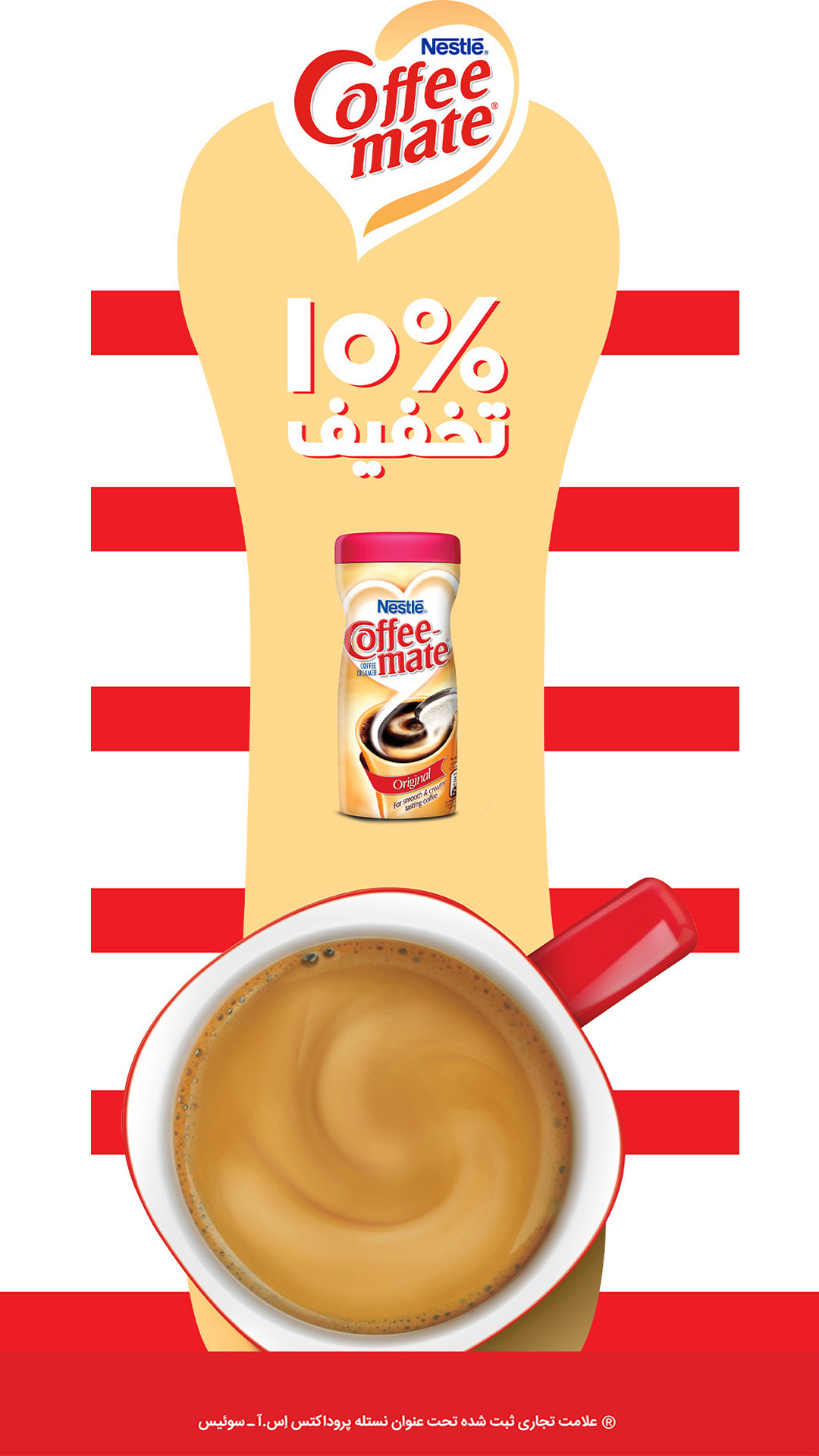
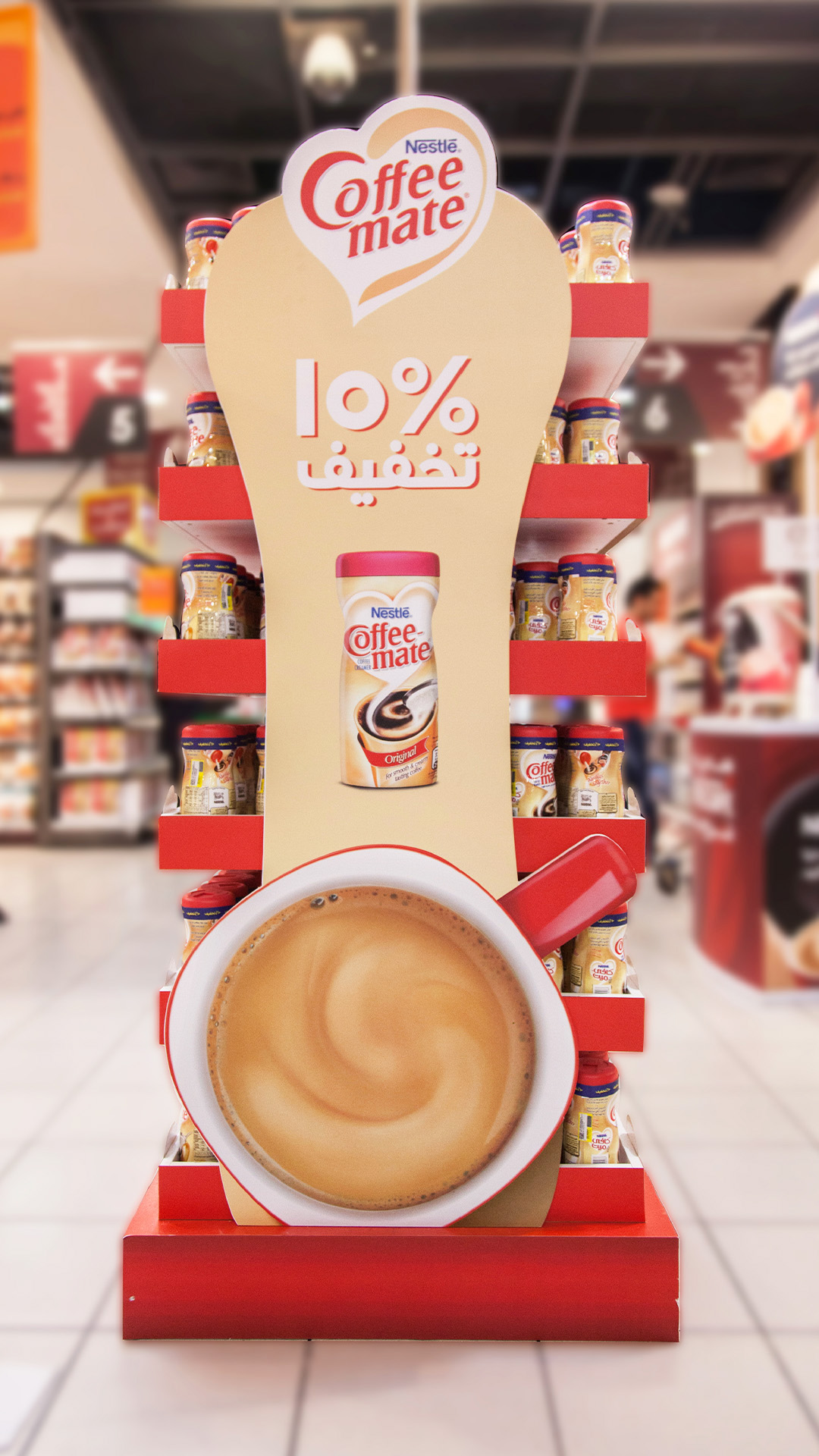
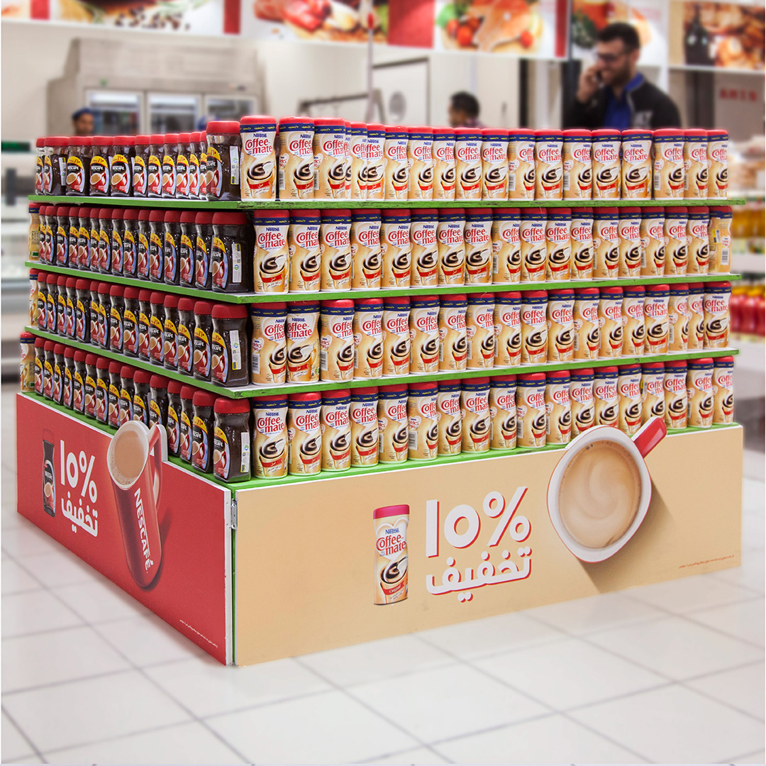
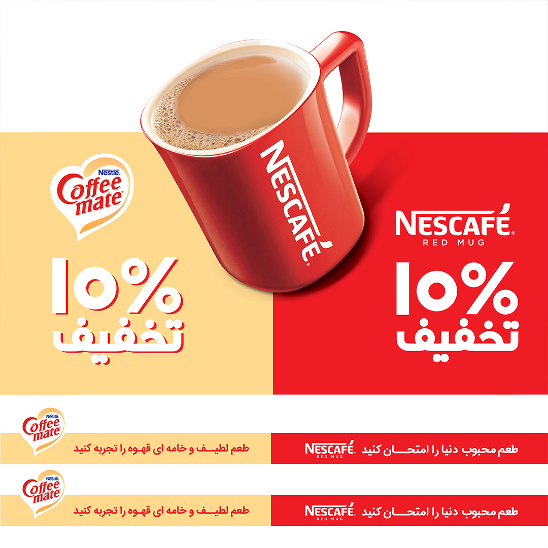
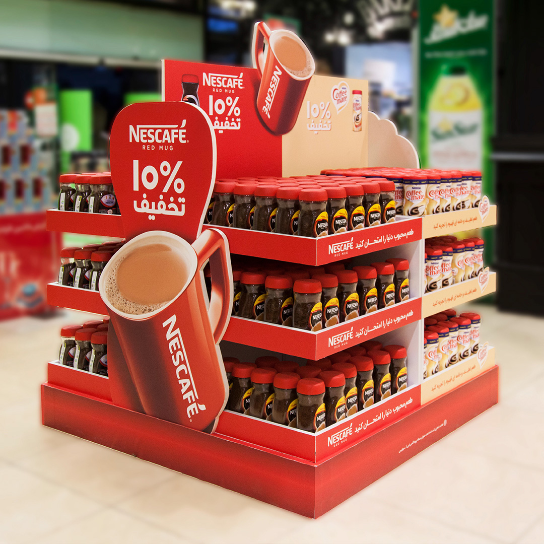
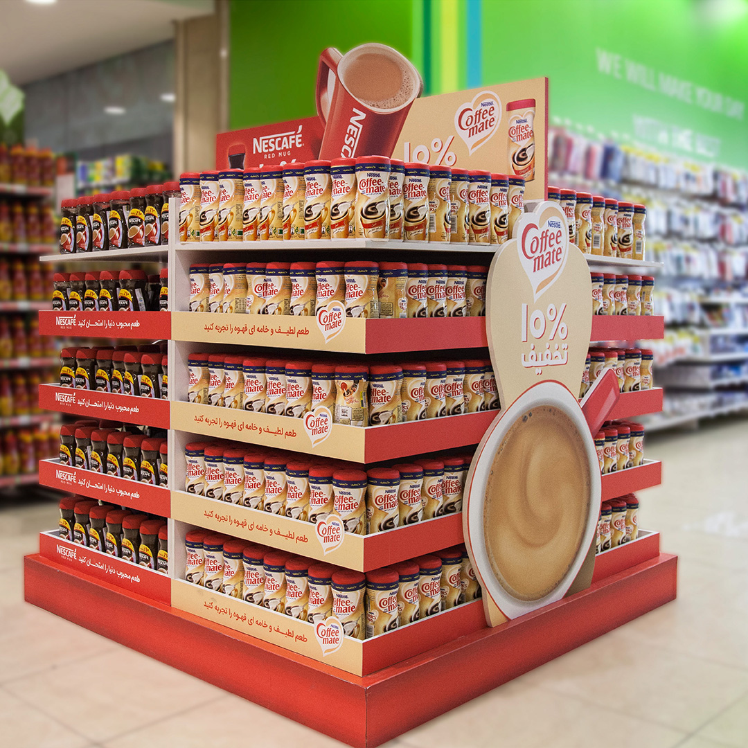
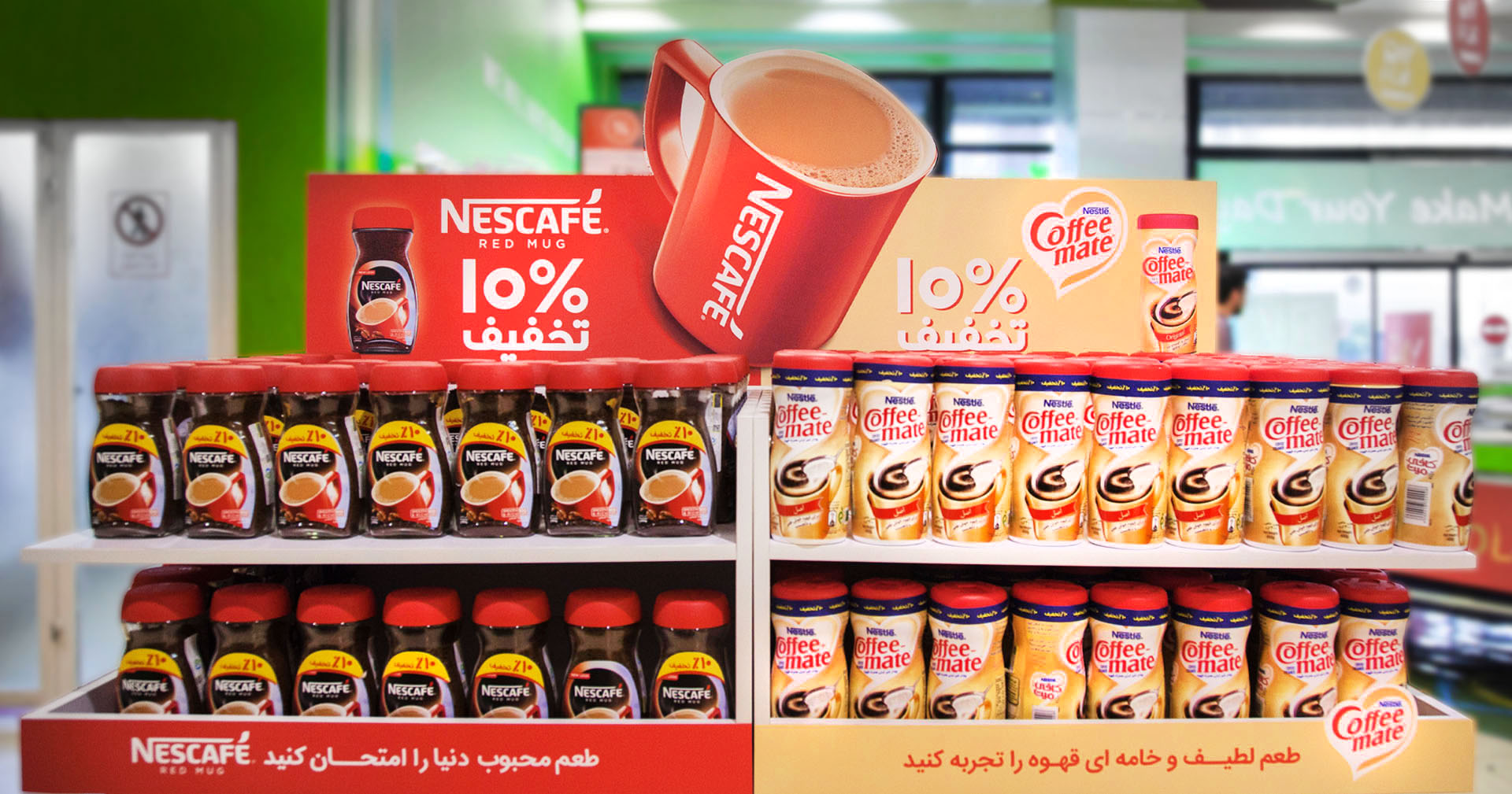
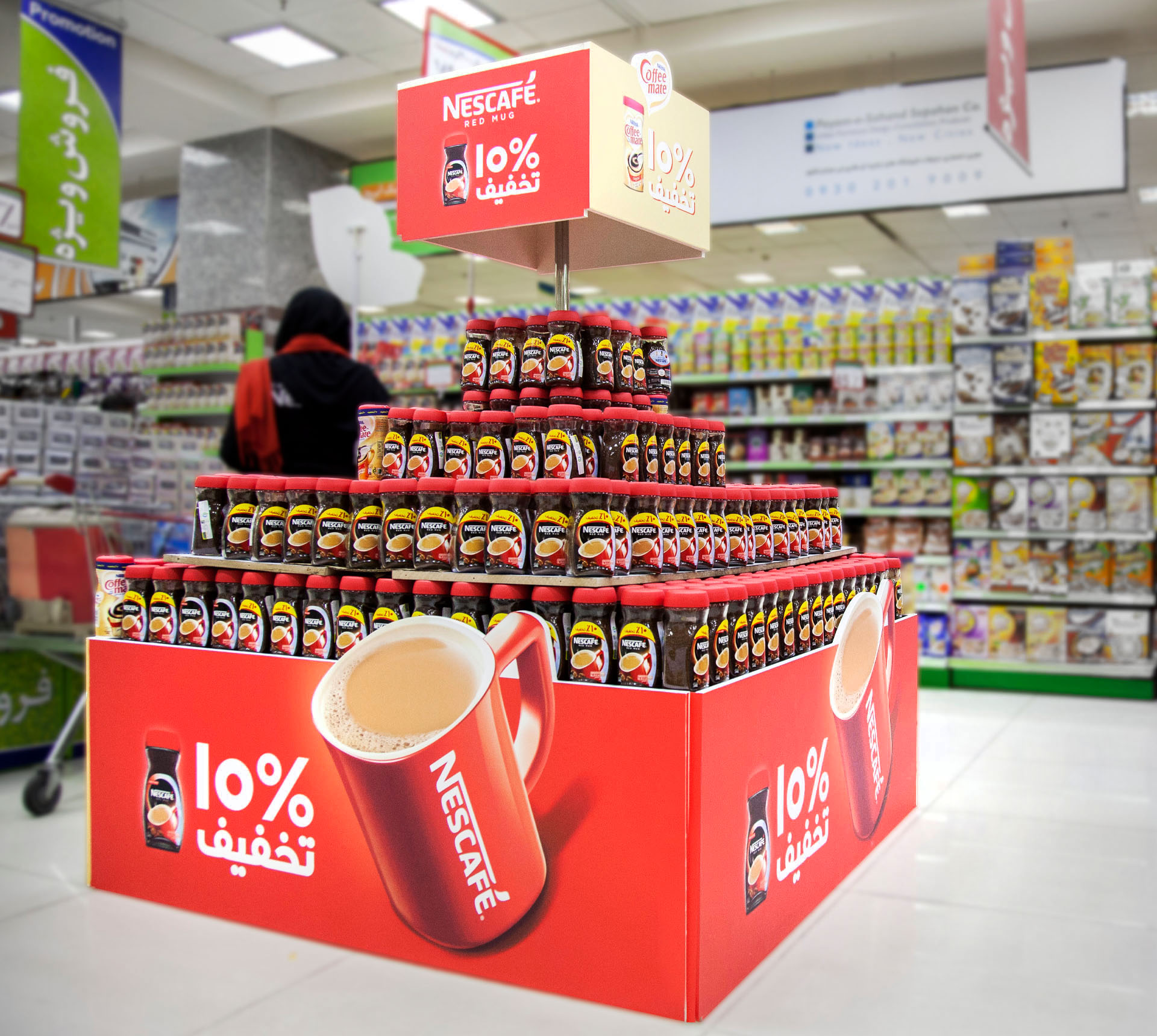
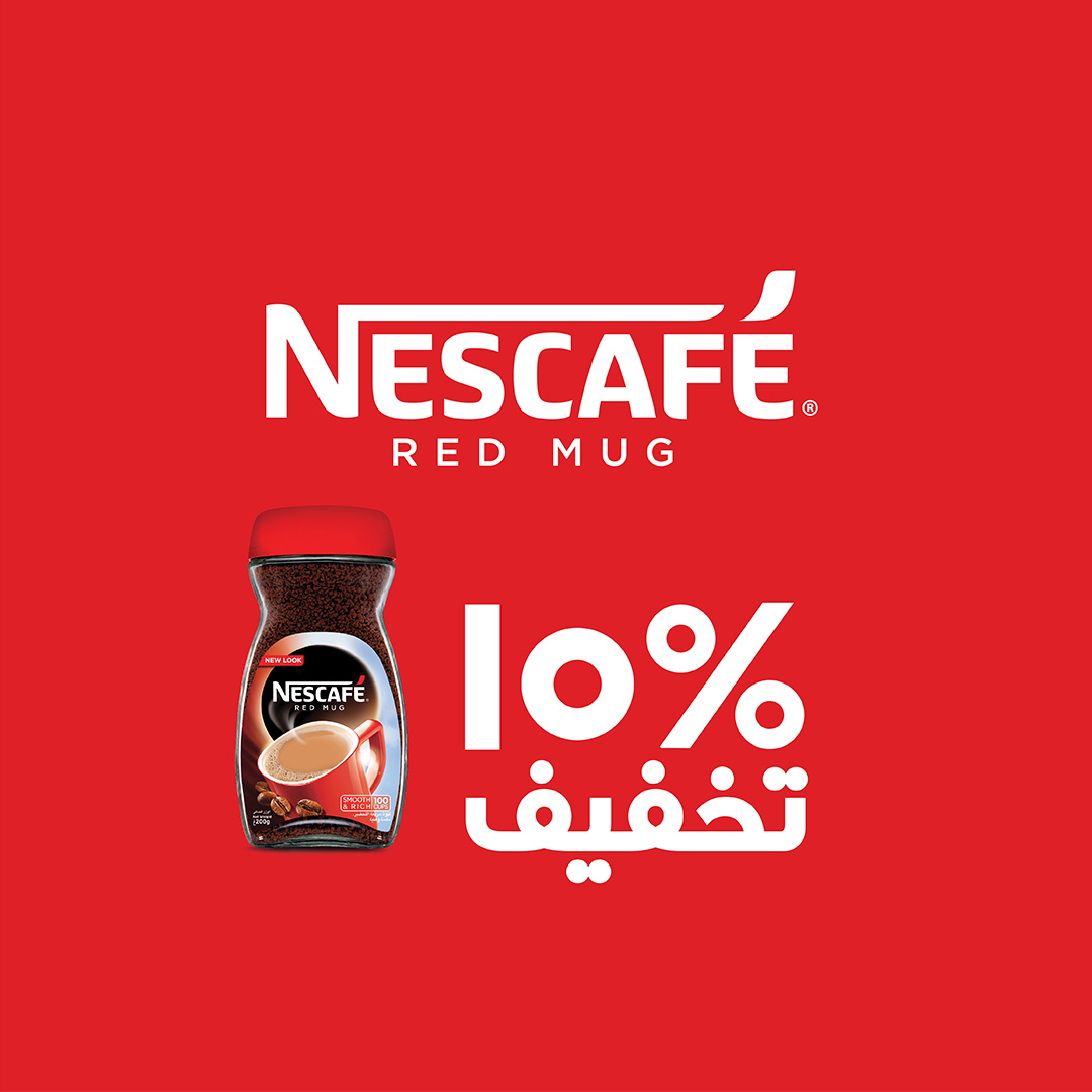
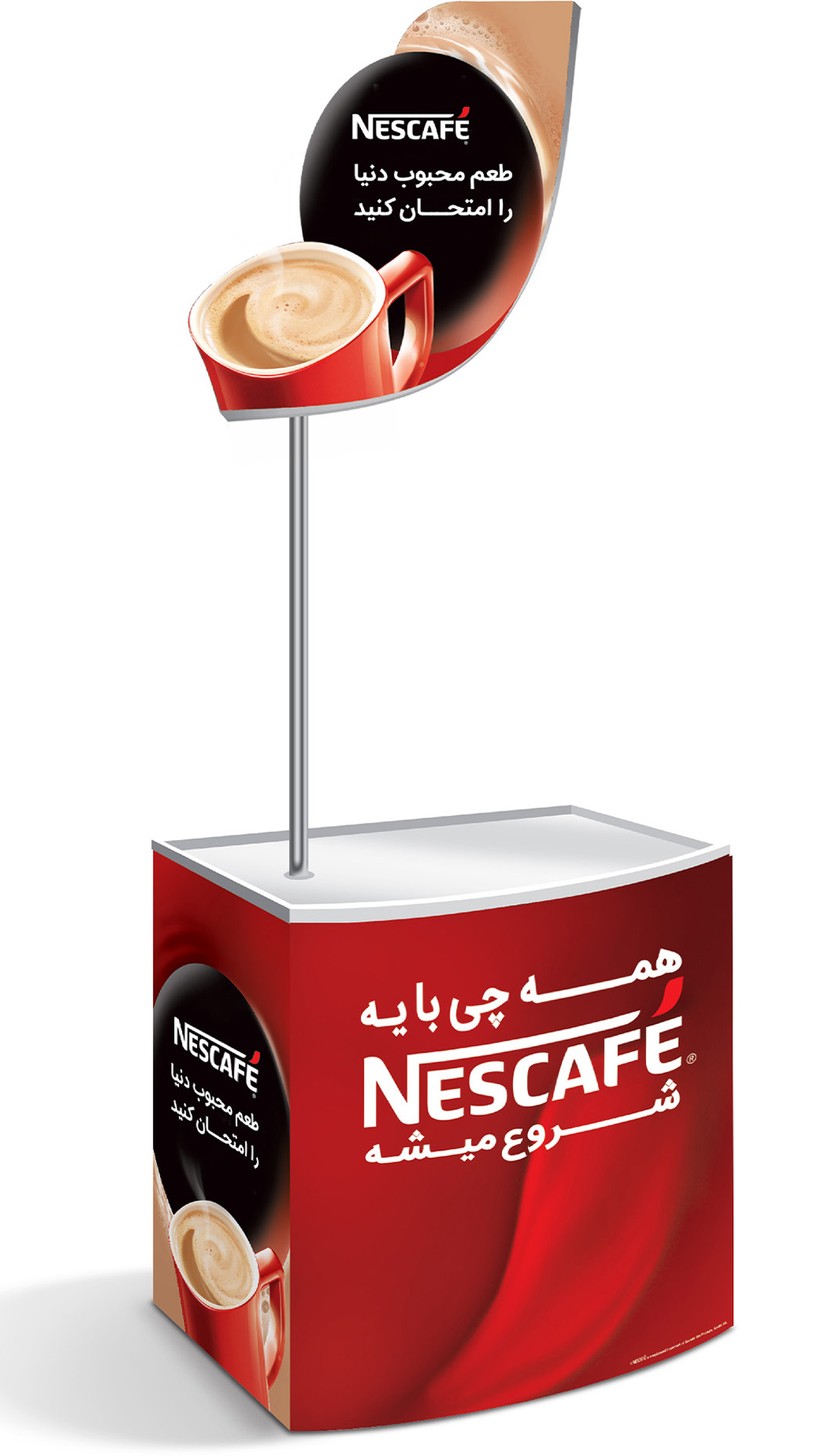
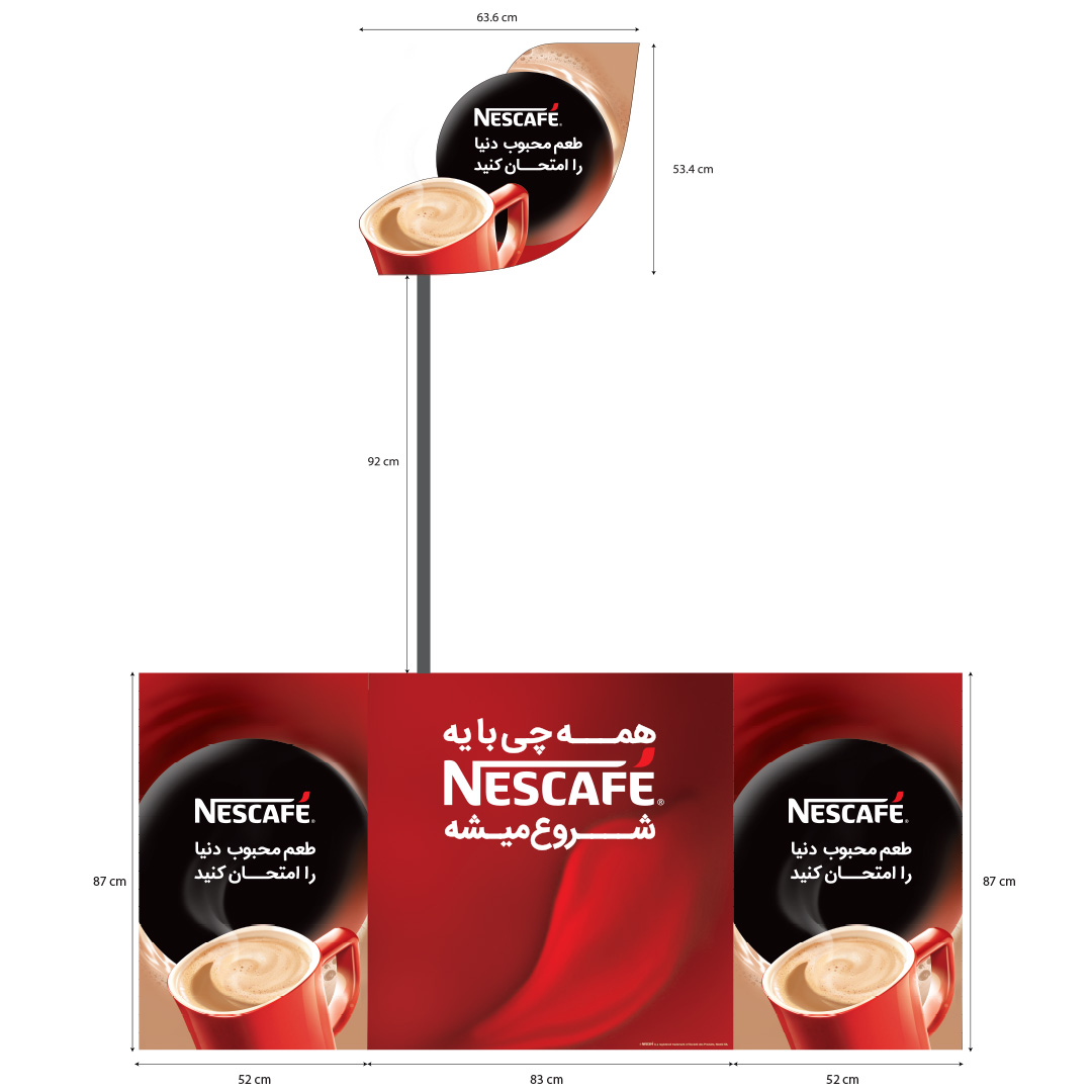
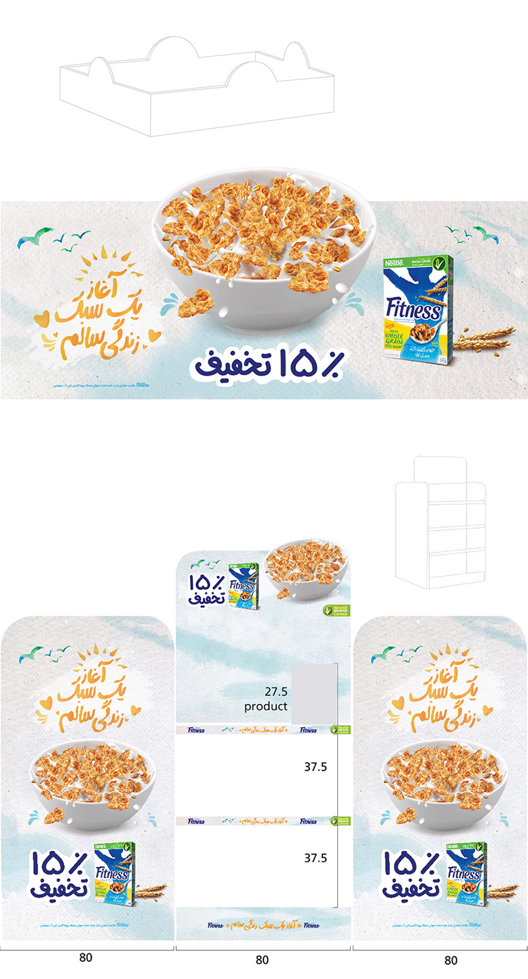
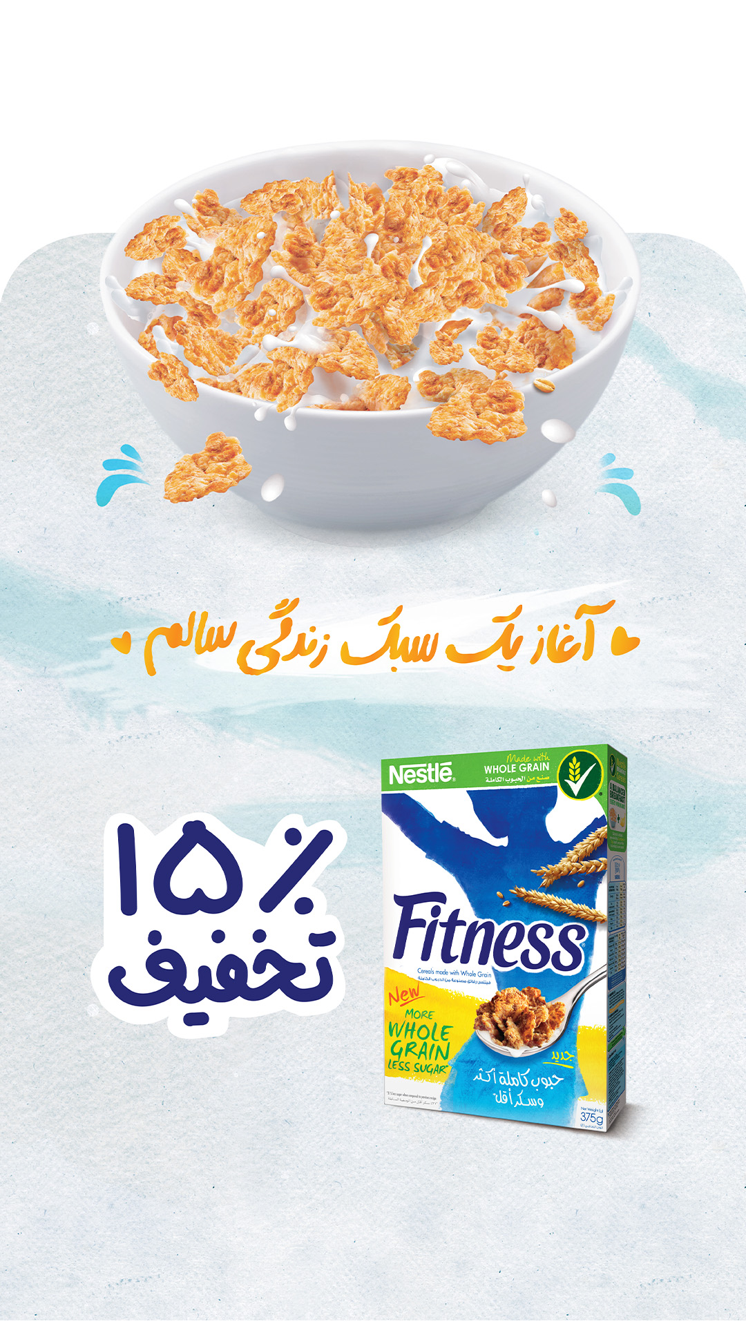
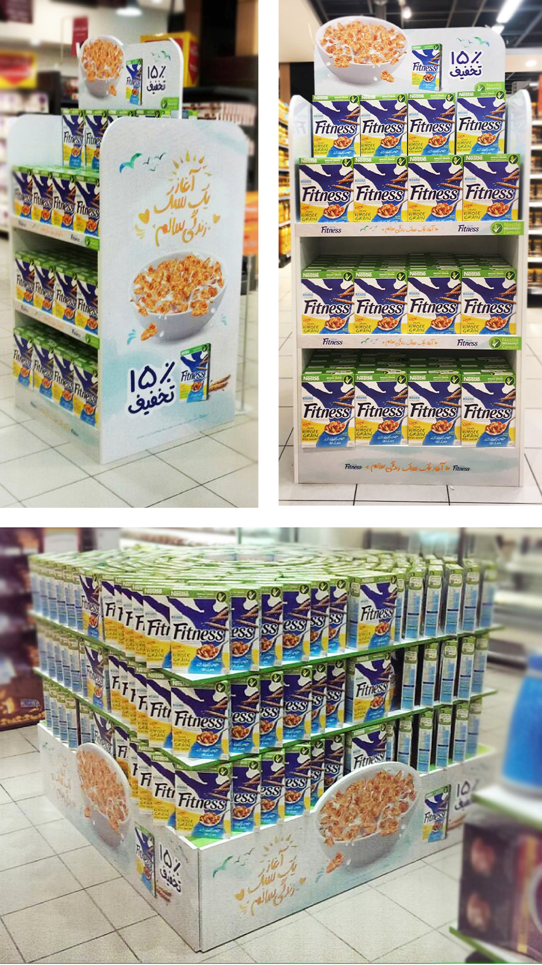
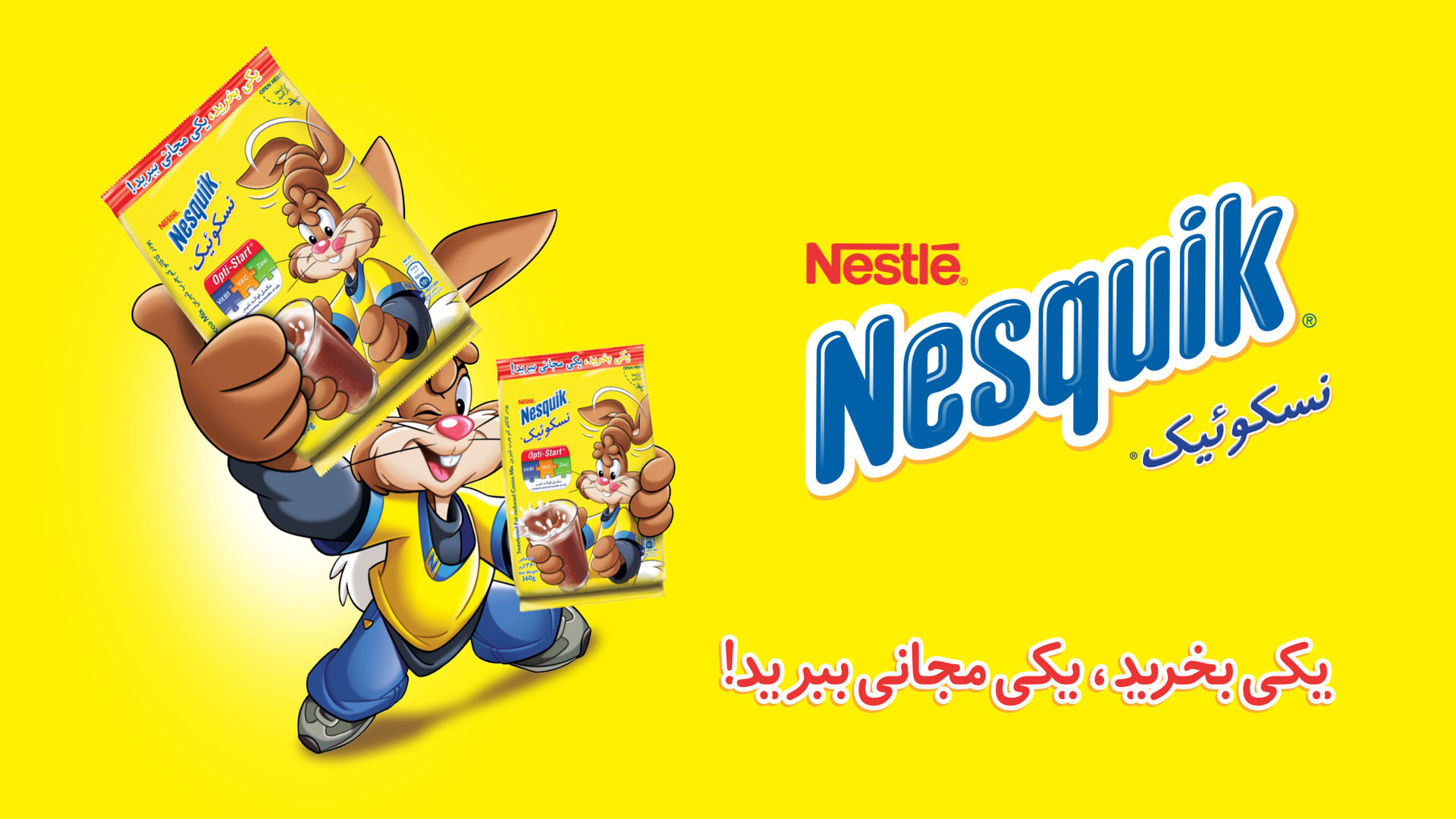
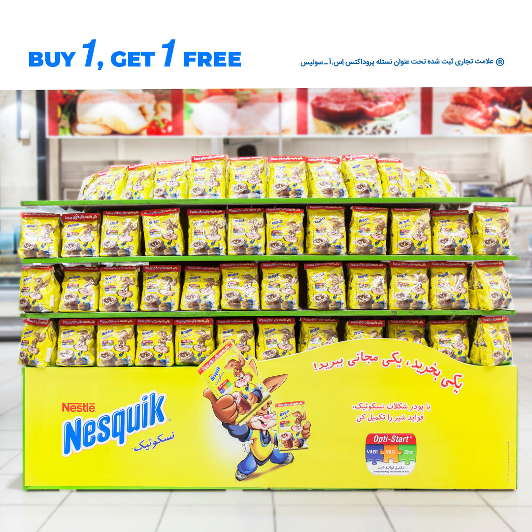
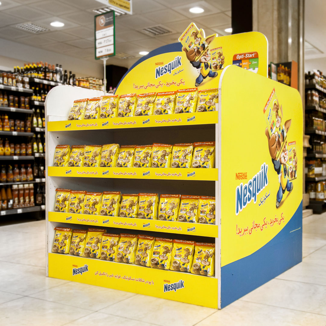
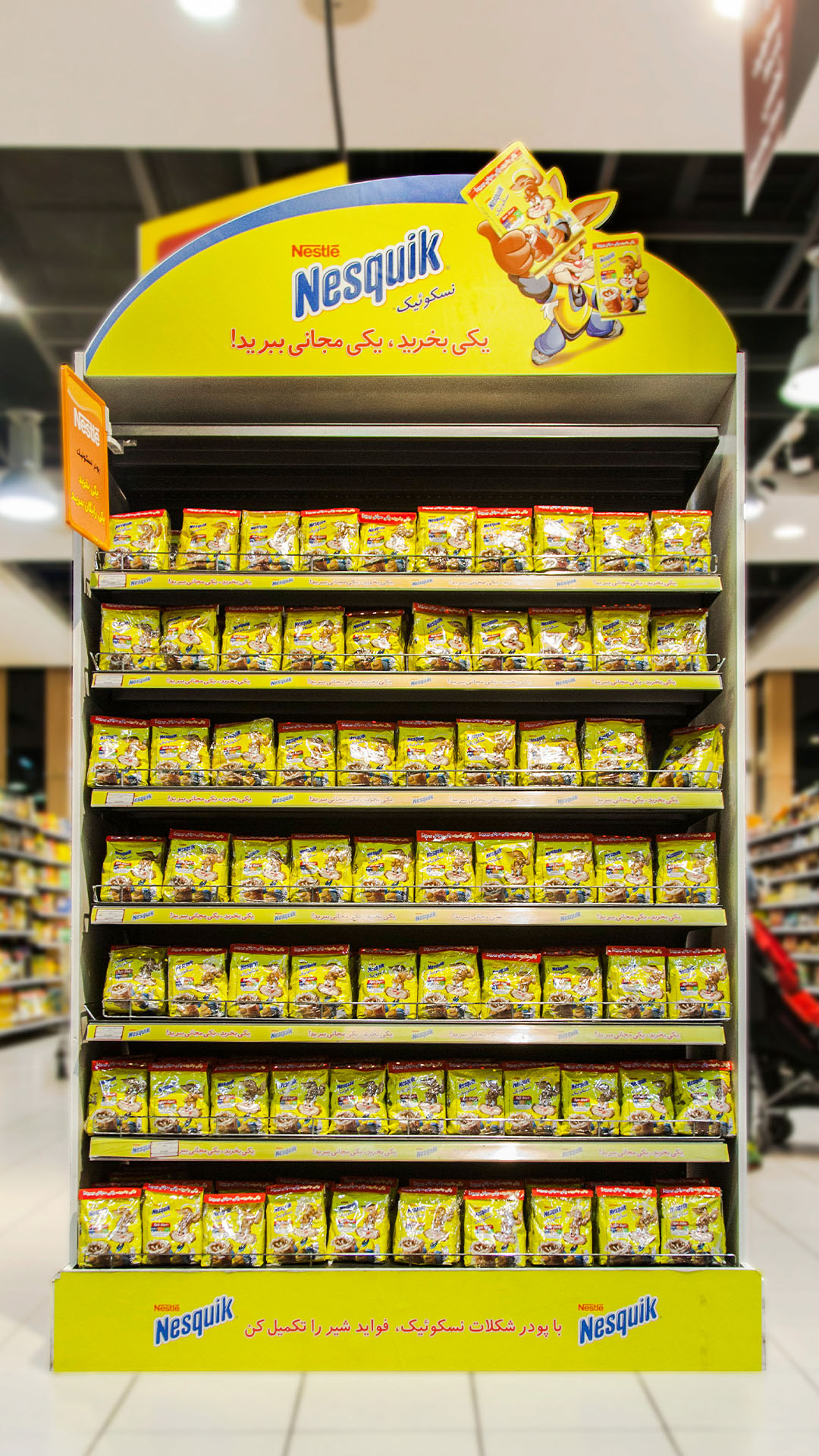
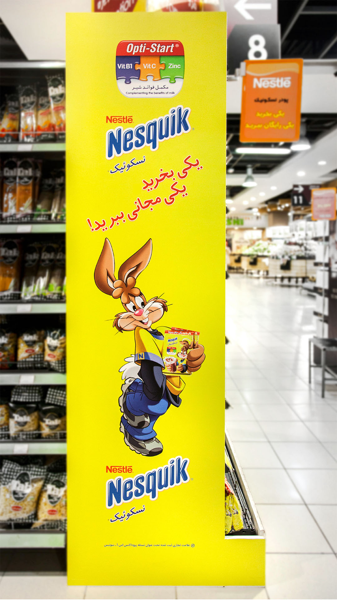
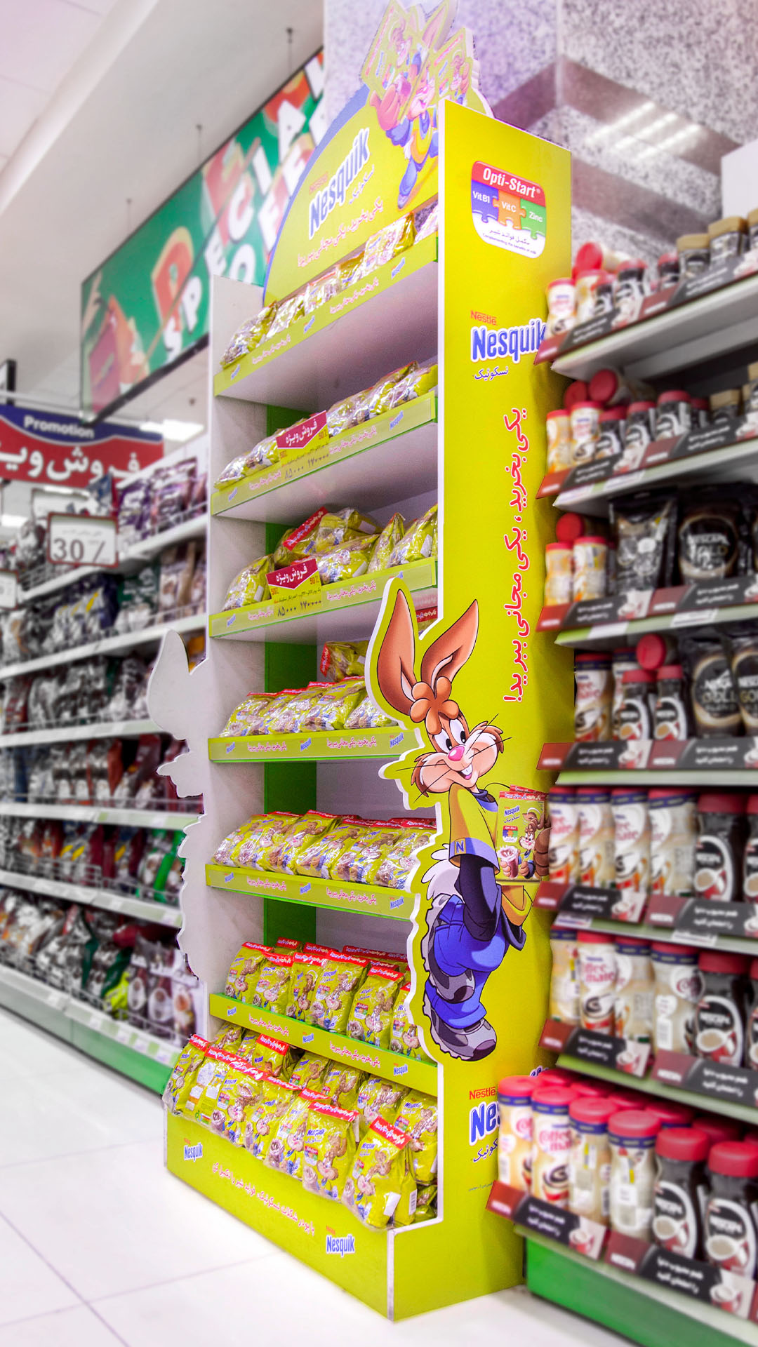
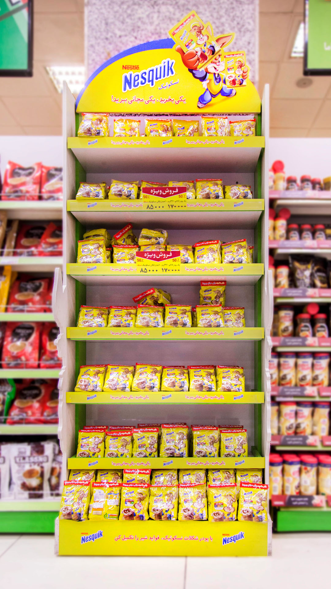
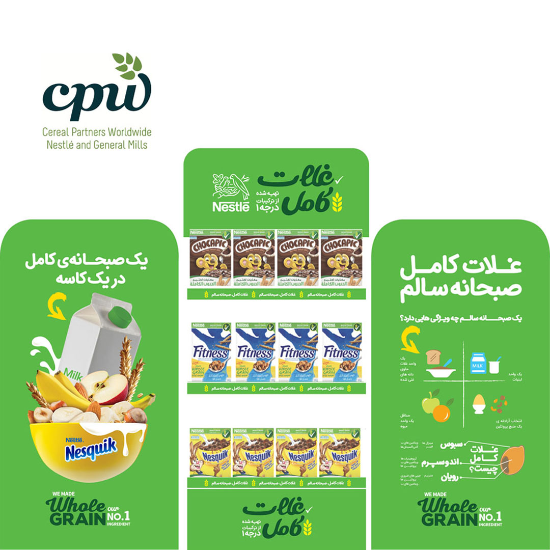
Simultaneously executed for Nestlé brands [Red Mug+Coffee Mate/ Nestlé Fitness/ Nesquik/ Nescafé Cappuccino/ Nescafé 3 in 1] across all over Iran.

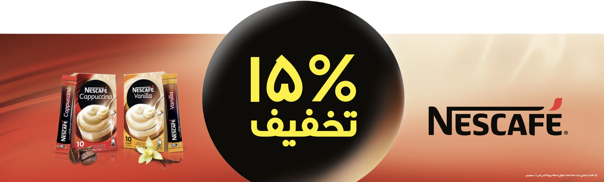
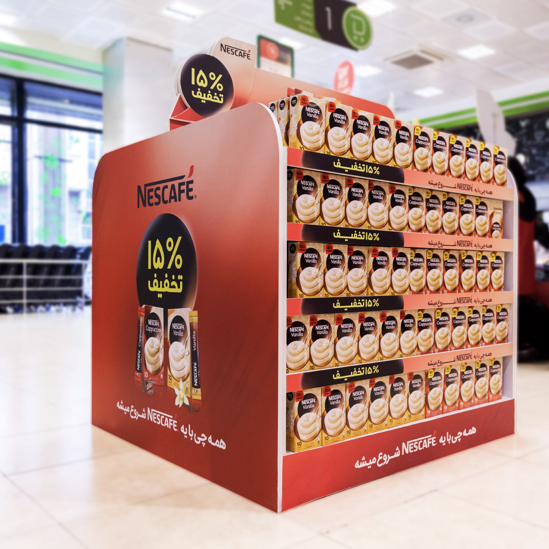
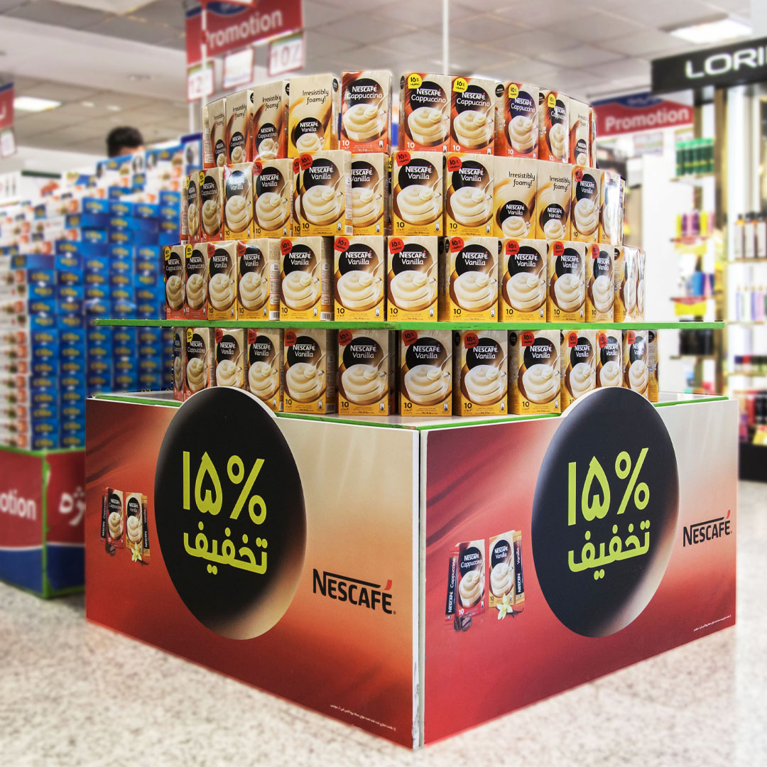
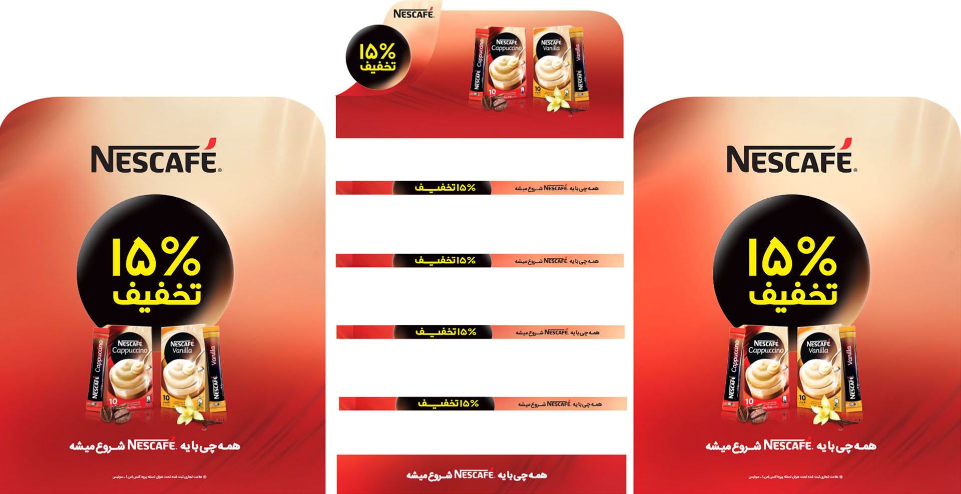
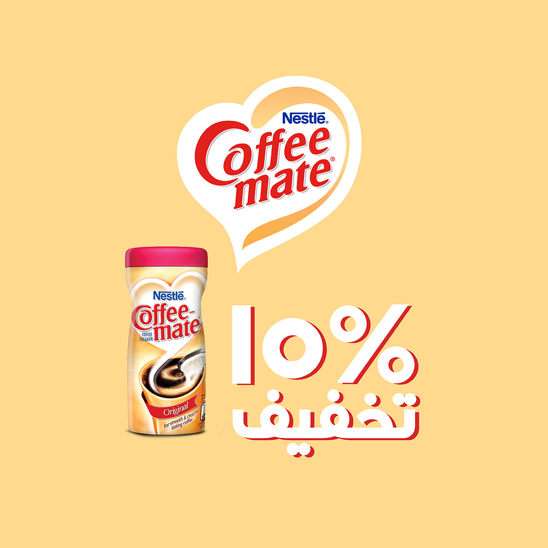
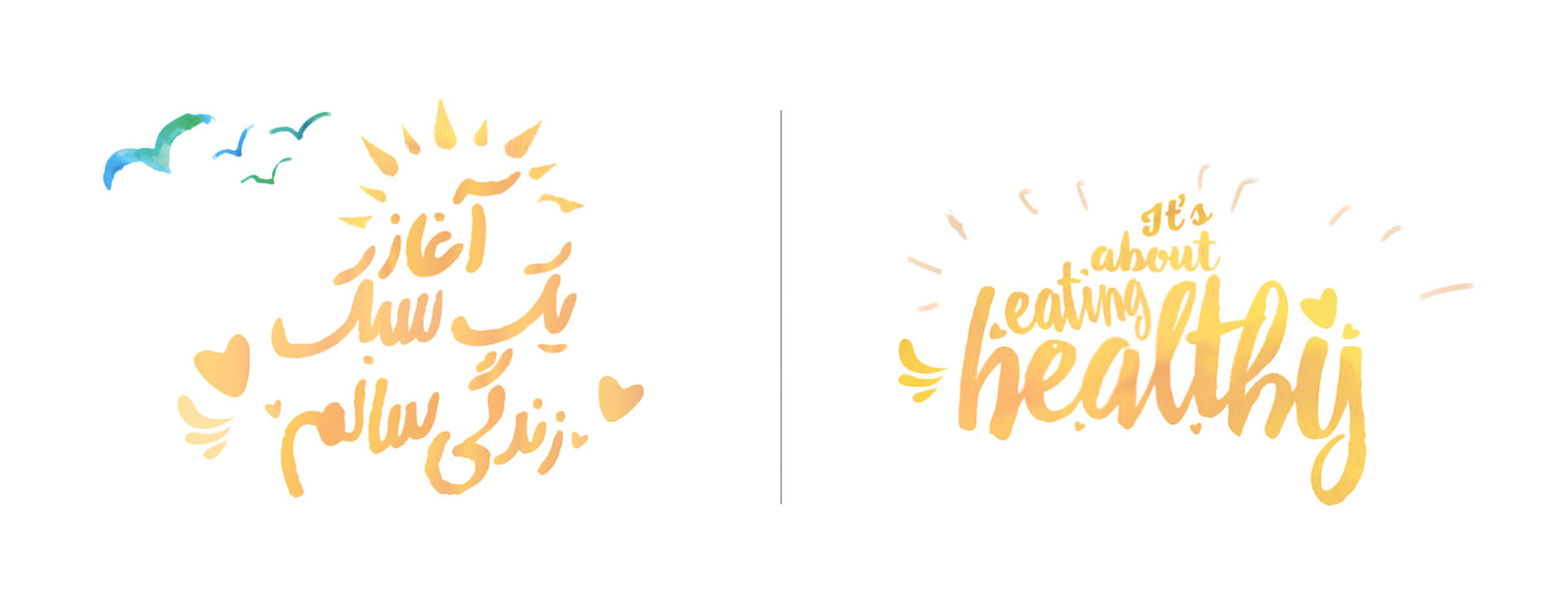
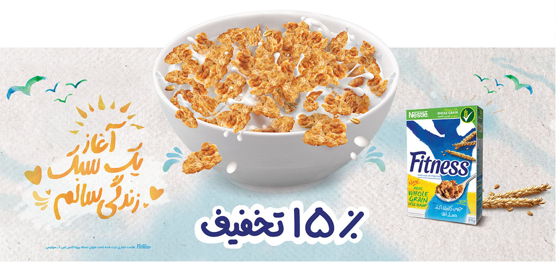
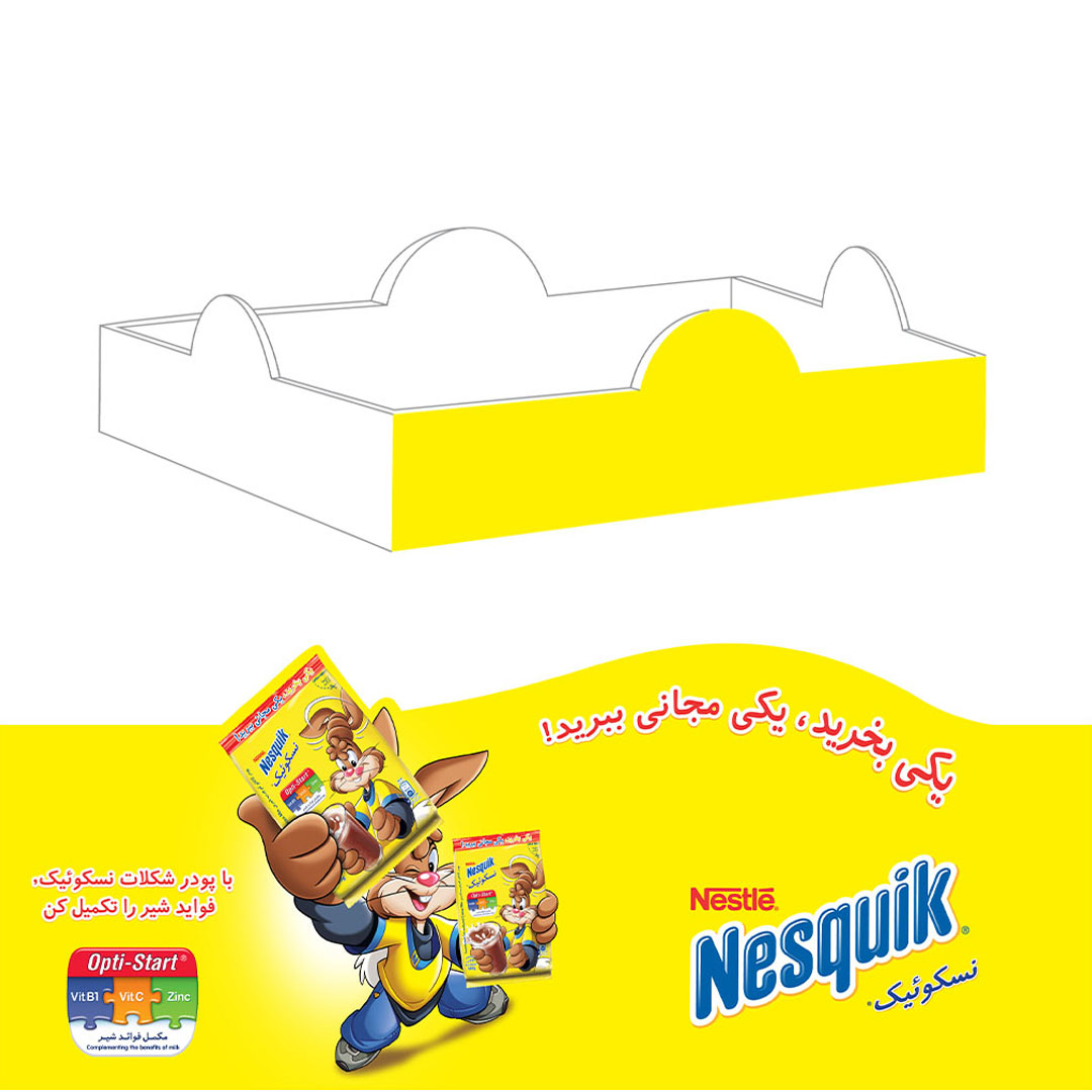
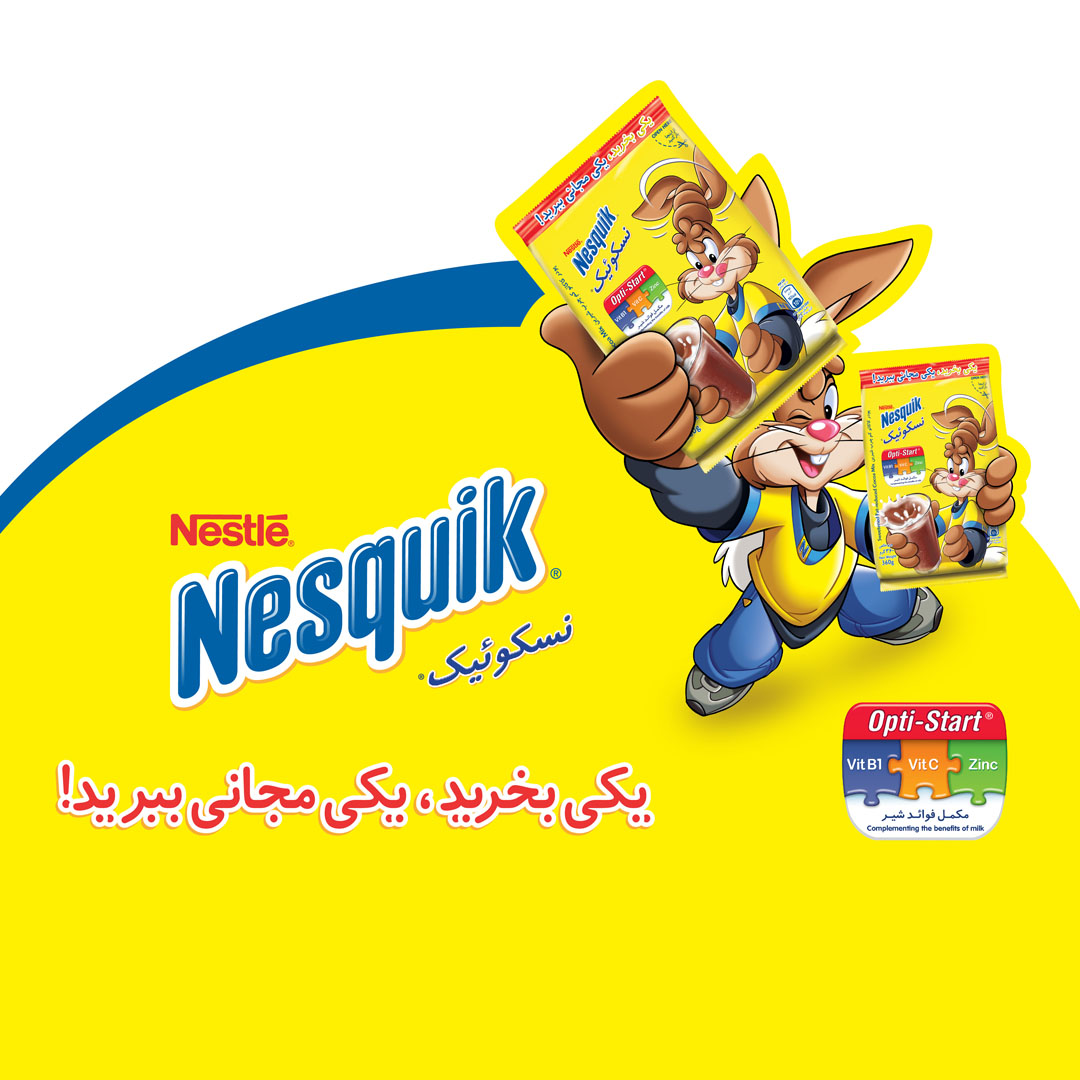
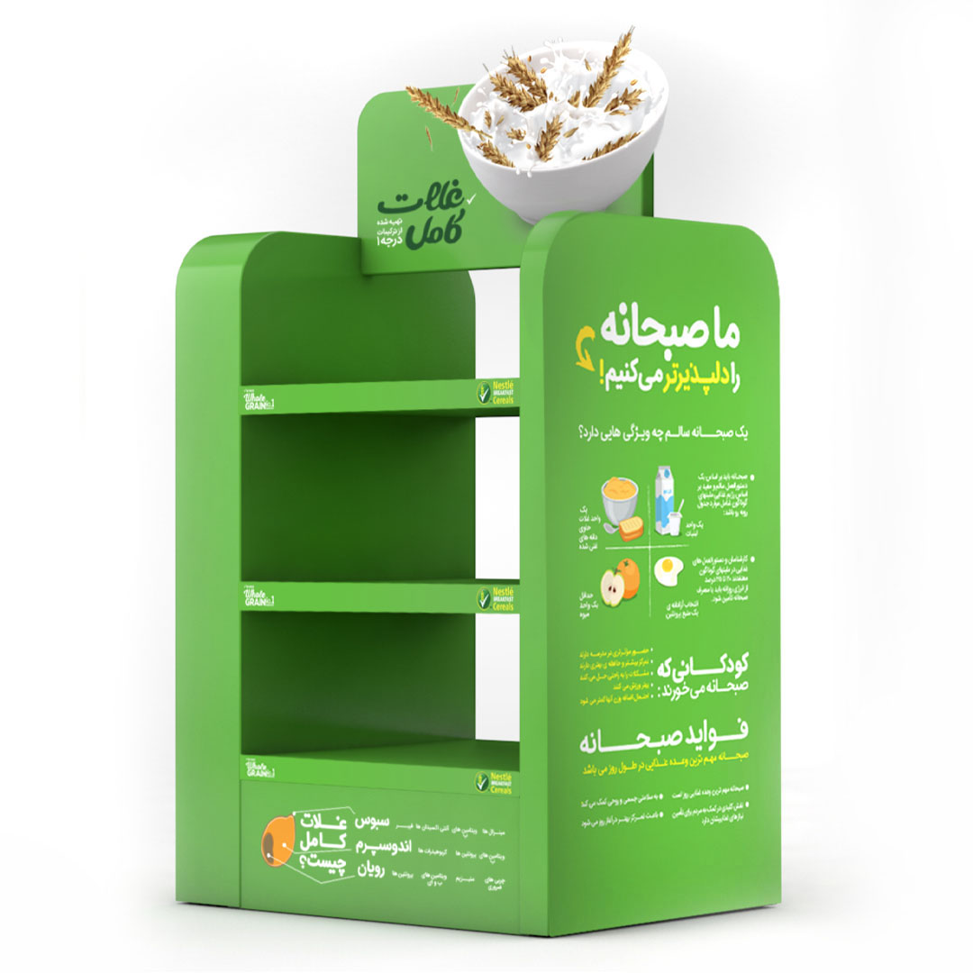
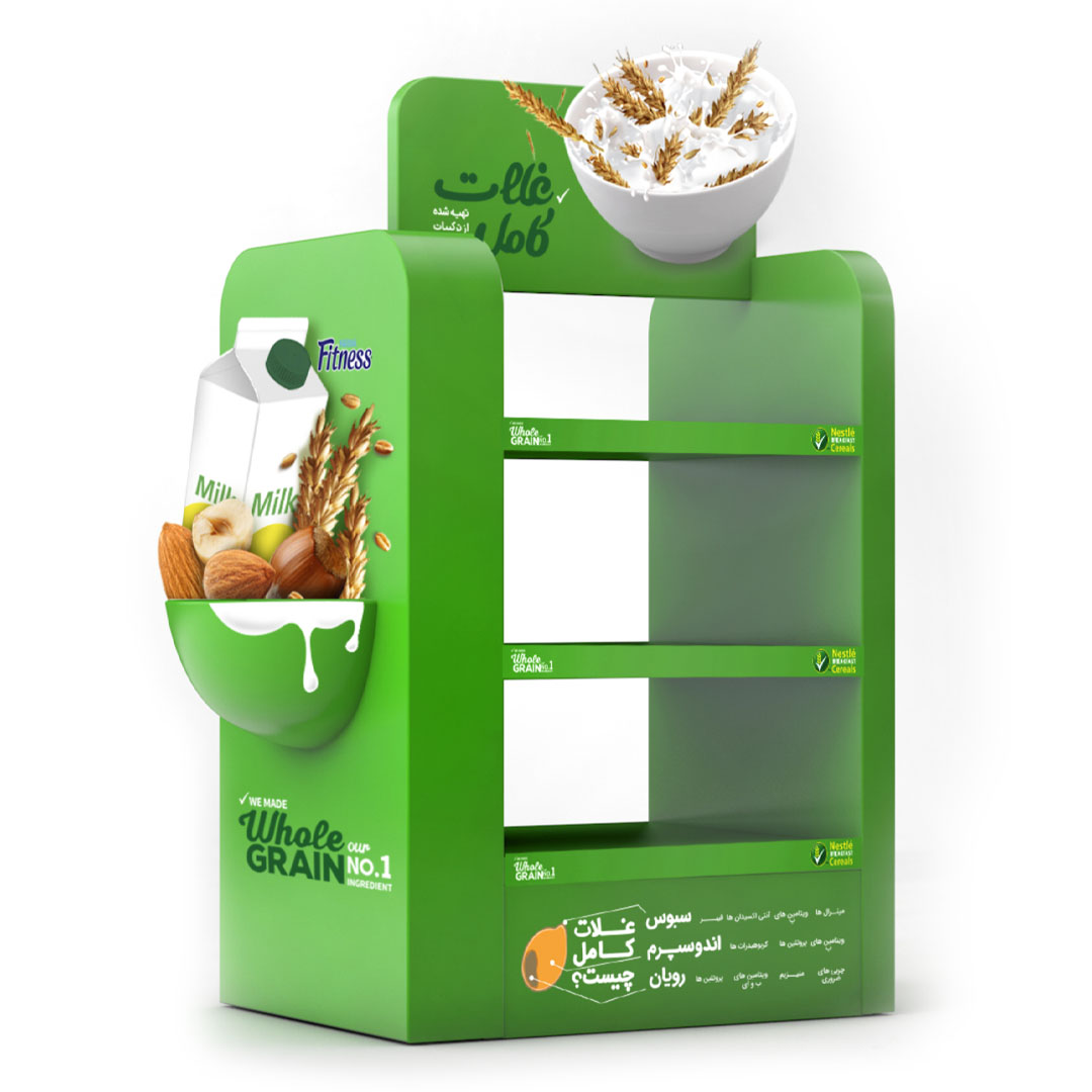
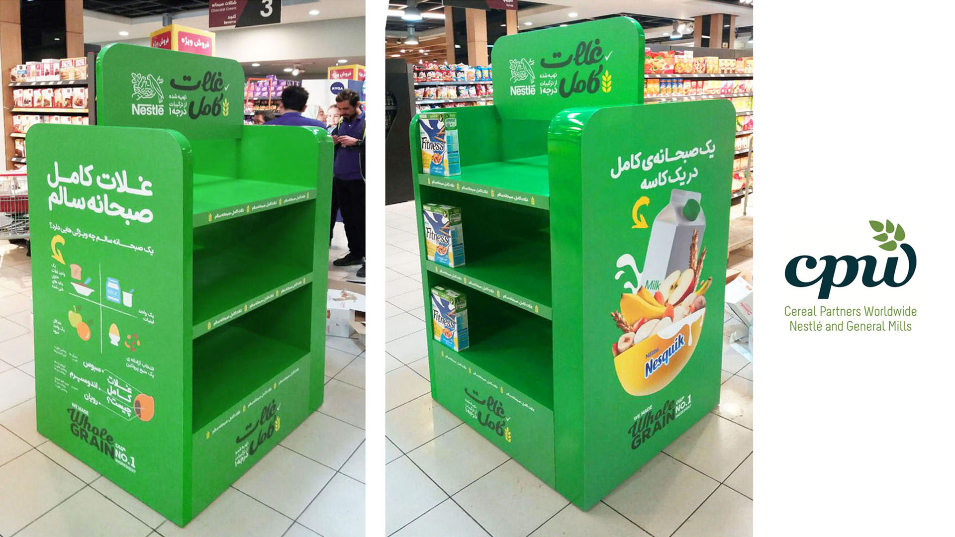
From September to December 2016, Nestlé in Iran launched an in-store advertising campaign for a large number of its brands. In this campaign, discounts ranging from 10% to 15% were offered on all participating products, and based on this promotion, various items such as product stands, islands, discount stickers, and similar promotional materials were designed.

Date: September-December 2016

Location: IRAN/ Tehran, Isfahan, Mashhad, Shiraz

Client: Nestlé Iran

Agency: Daarvag International

Art Direction: Sogol Majidi

Adaptation, Design and Technical Files: Sogol Majidi

Photographer: Hessam Yekta

Account Director: Sepideh Nazari

Production Managers: Hadi Nikpour / Emad Anooshiravani

For Nescafé sachet products (Classic Cappuccino and Vanilla Cappuccino), stands, islands, pallets, and stickers were designed with a focus on 10% and 15% discounts. My main focus was to create a consistent and unified visual identity across all campaign formats and sizes. The top-view image of the Nescafé Red Mug and Coffee-Mate served as the key visual element, playing a significant role in establishing this visual coherence for the audience.

Nescafé Red Mug + Coffee Mate

IRAN/ Tehran, Isfahan, Mashhad, Tabriz
SEP/OCT/NOV/DEC 2016

Simultaneously executed promotional campaign for Nestlé brands [Red Mug+Coffee Mate/ Nestlé Fitness/ Nesquik/ Nescafé Cappuccino/ Nescafé 3 in 1] across all over Iran.

Islands and Product Stands

On the island units—structures accessible from all four sides—the main focus remained on the 10% discount and the top-view image of the Red Mug and Coffee-Mate, ensuring that the mouthwatering appeal of the product was effectively conveyed.

Nescafé Promoter Stand

The Nescafé promoter stand was designed with the slogan “Taste the world’s favorite coffee,” focusing primarily on the Nescafé logo accent as the brand signature. The image of the Nescafé cup was also used as the header and on the sides of the stand to maintain design consistency.

It All Starts With Nescafé

The slogan “Everything starts with a Nescafé,” aligned with the global brand message, was paired with the warm and comforting imagery of Nescafé coffee as the key visual. This combination of the accent mark and the rising steam from the coffee cup created a distinctive and memorable visual impression for the audience.

Nestlé Fitness

It’s about eating healthy

For Nestlé Fitness products, we began with the slogan “It’s about eating healthy,” which I adapted into Persian while preserving the original typography, curves, colors, and line characteristics to maintain global visual consistency.
The main visual featured a bowl filled with milk and Nestlé Fitness cereal, highlighting the product’s content while emphasizing both the promotional discount and its appetizing, mouthwatering nature.

My goal was to simplify and emphasize this character to make it stand out more clearly.

Nesquik / Buy 1, Get 1 Free!

In the Nesquik section, the key visual featured Quicky—the brand’s mascot—holding two cocoa powder packs, representing the main call to action: “Buy one, get one free.” The Opti-start table, showcasing the product’s vitamins (Vitamin B1, Vitamin C, and Zinc), served as the primary focus and visual element under the message “Complementing the benefits of milk.”

We Made Whole Grain No.1 Ingredient

In the Whole Grain section, the CPW global typography was adapted to ensure a unified visual experience, and the main visual—“a complete breakfast in one bowl”—was presented using stickers and, in some stands, physical mockups.