Ladan Lifeoil

New product 360° Launch campaign

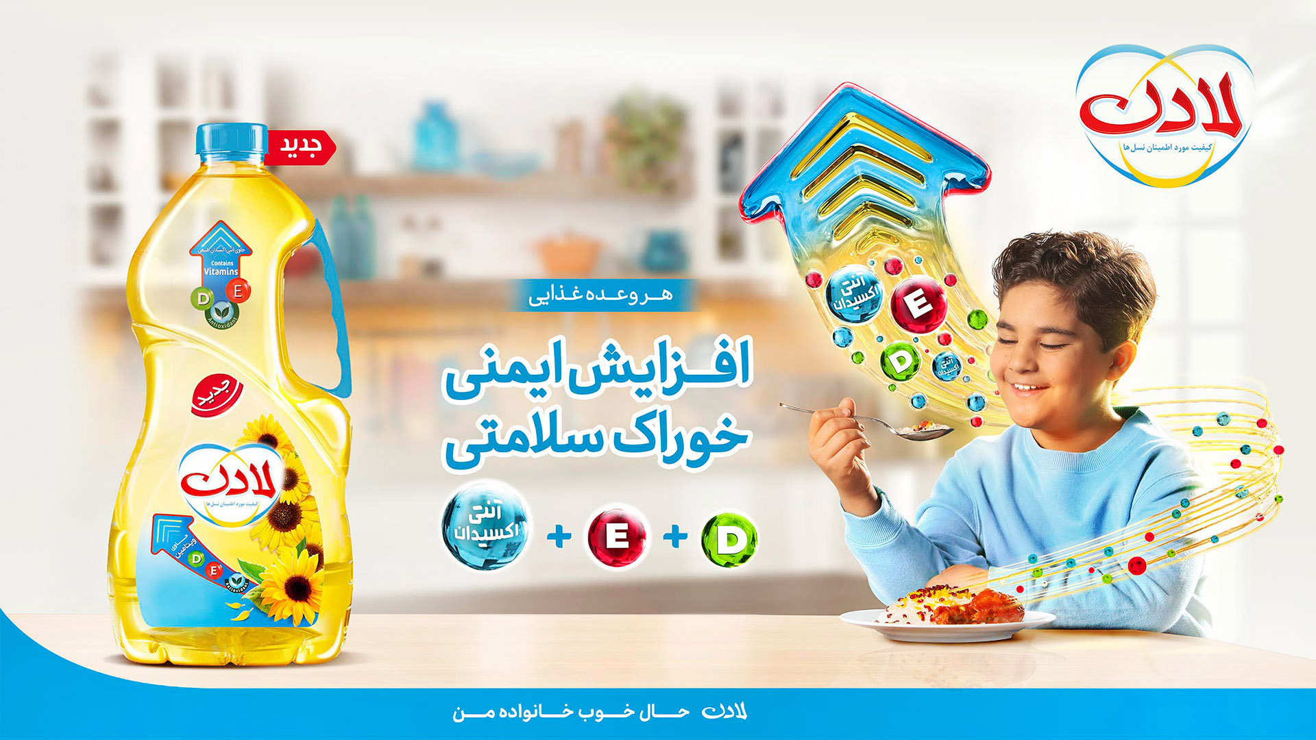
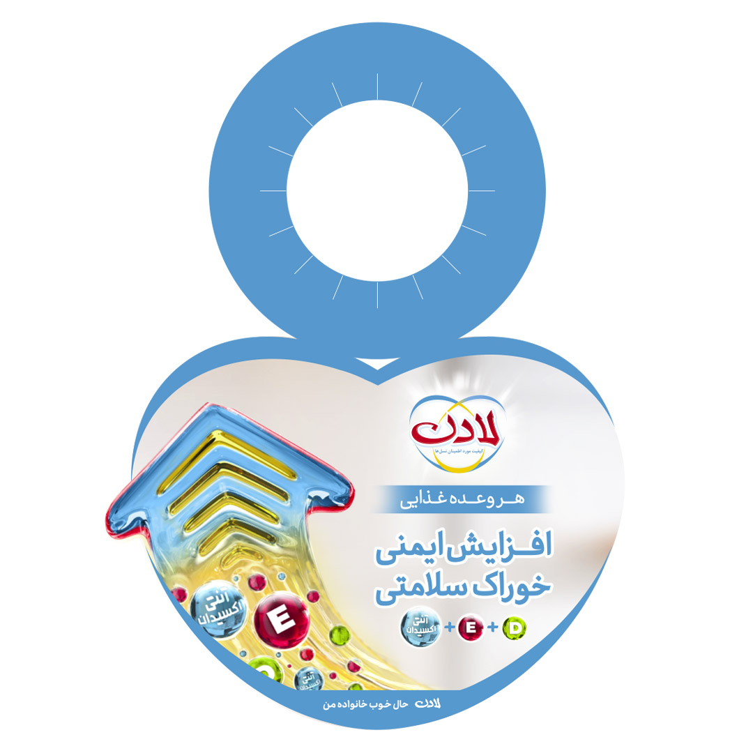
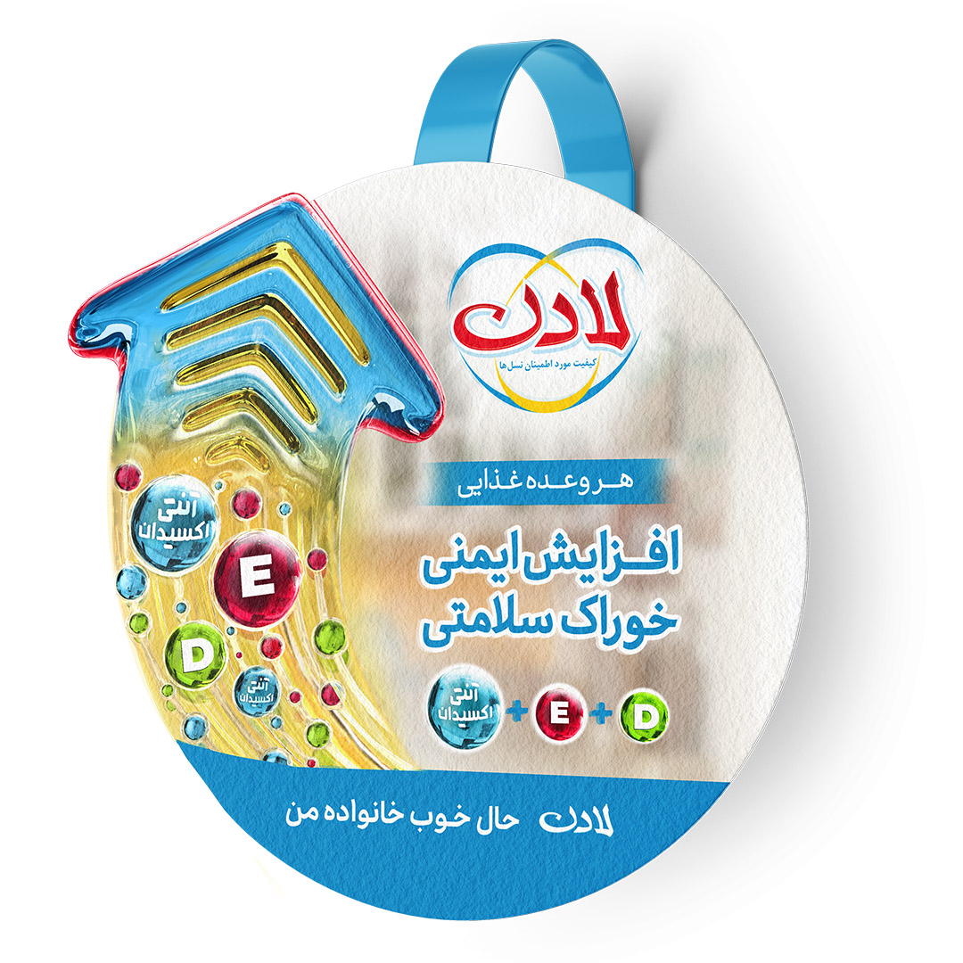
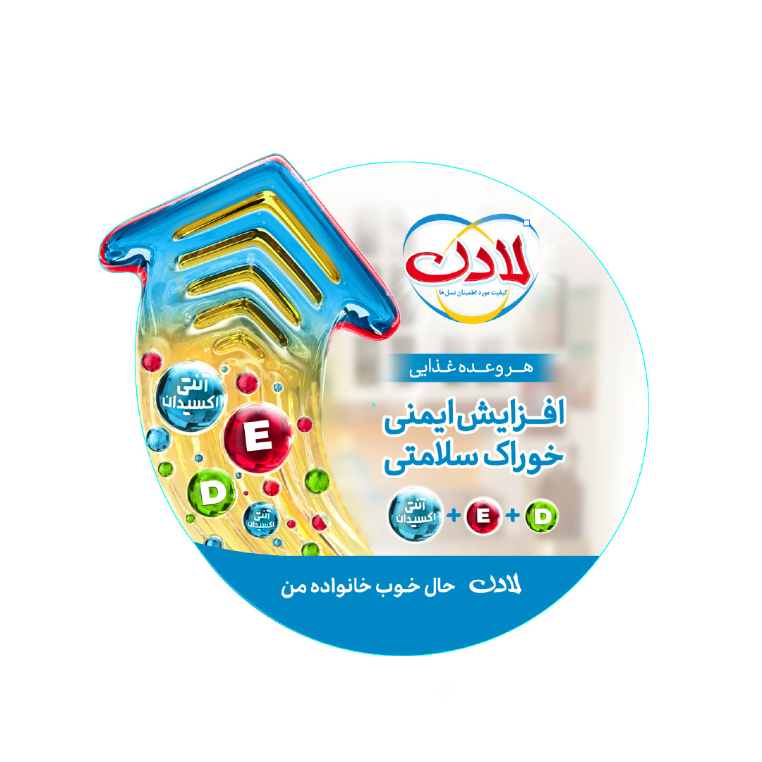
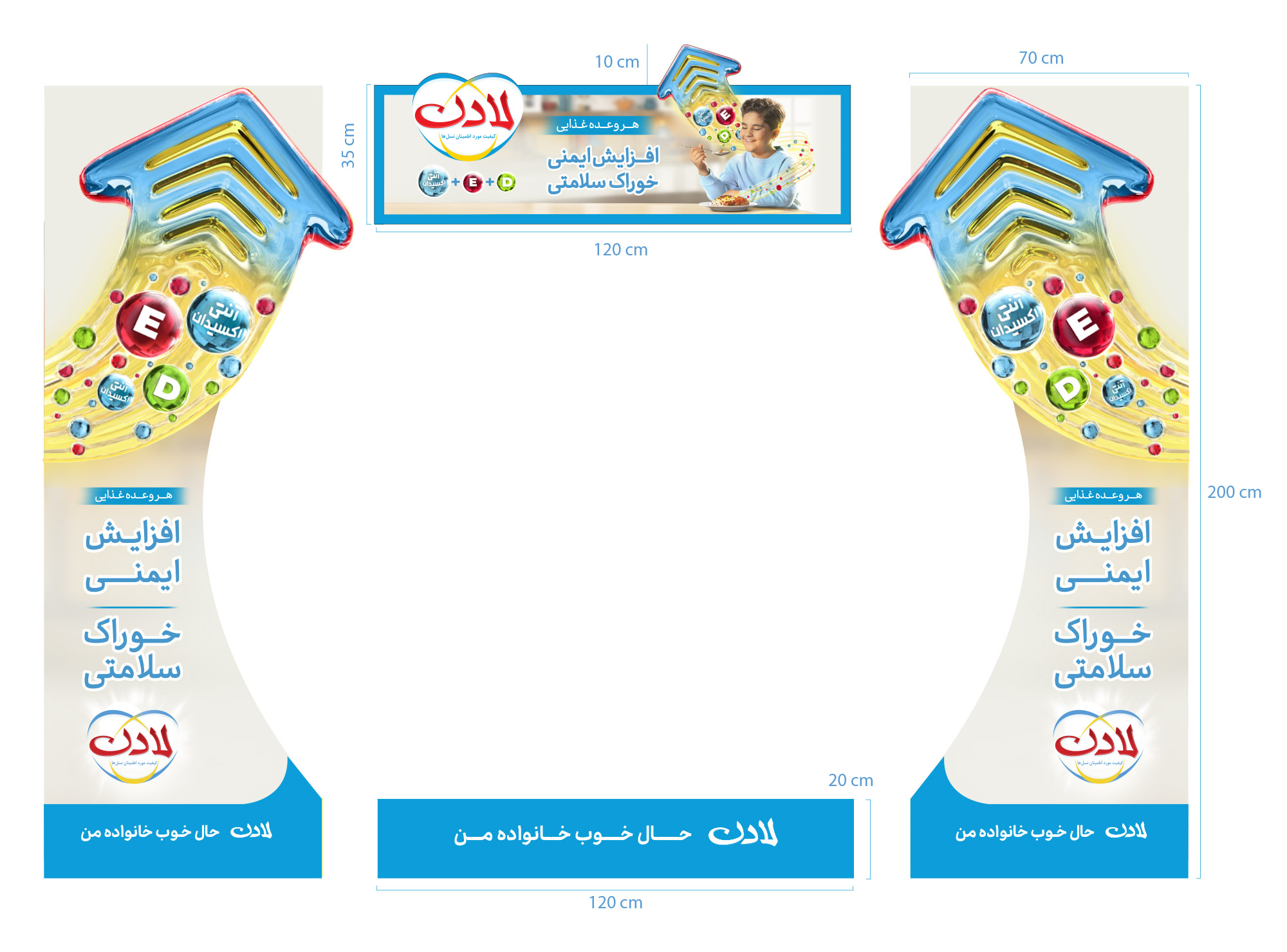
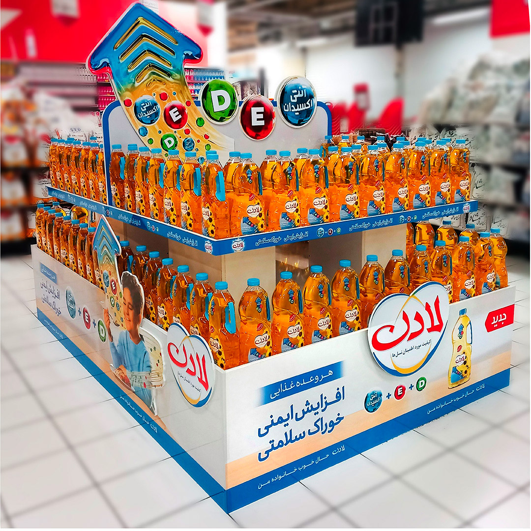
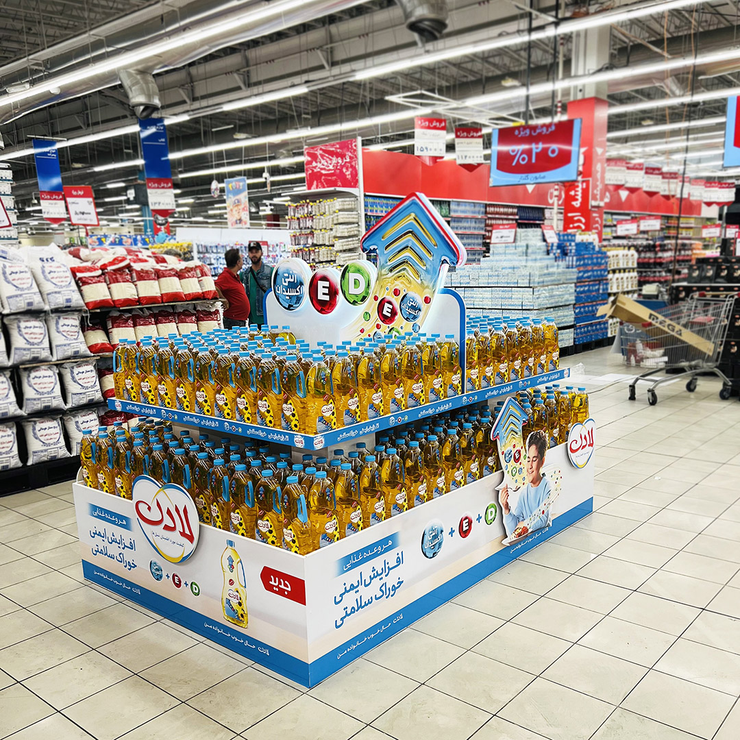
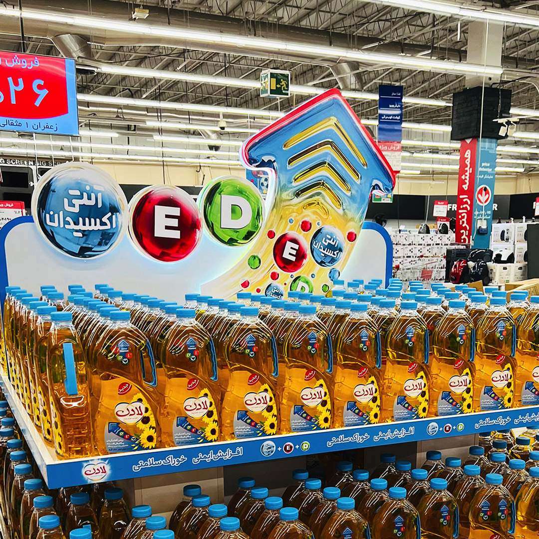
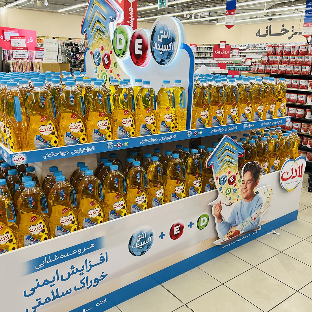
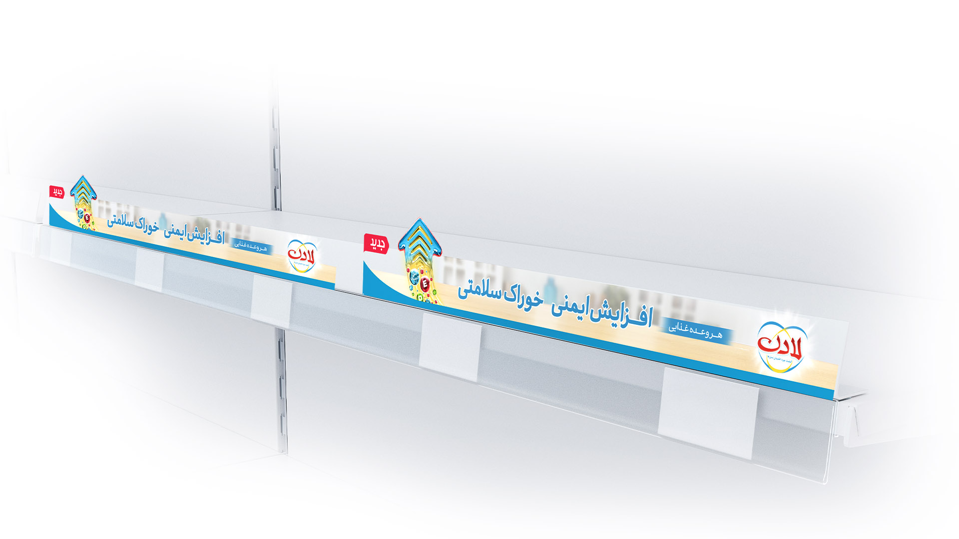
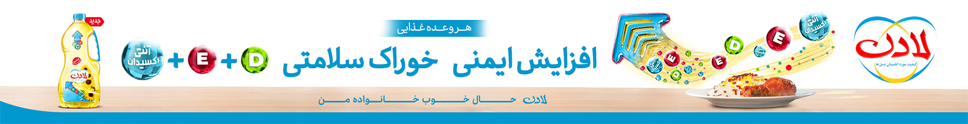
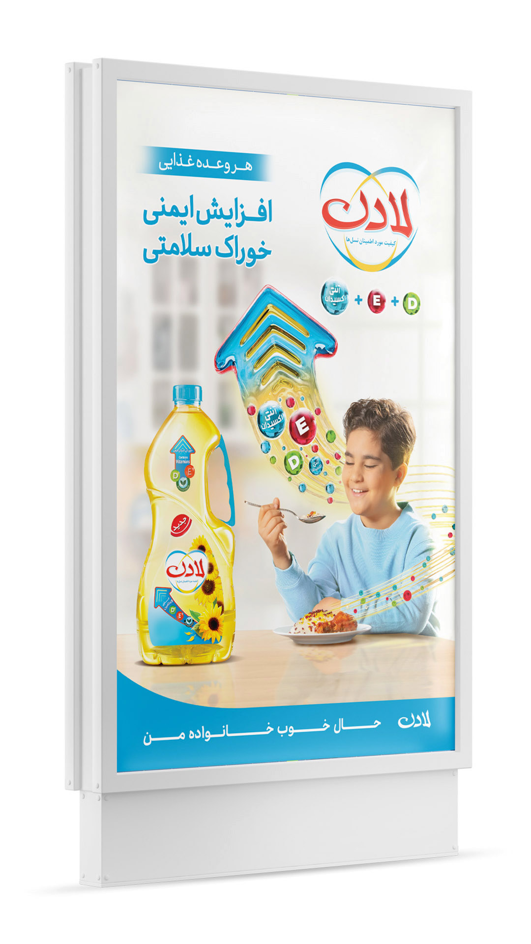
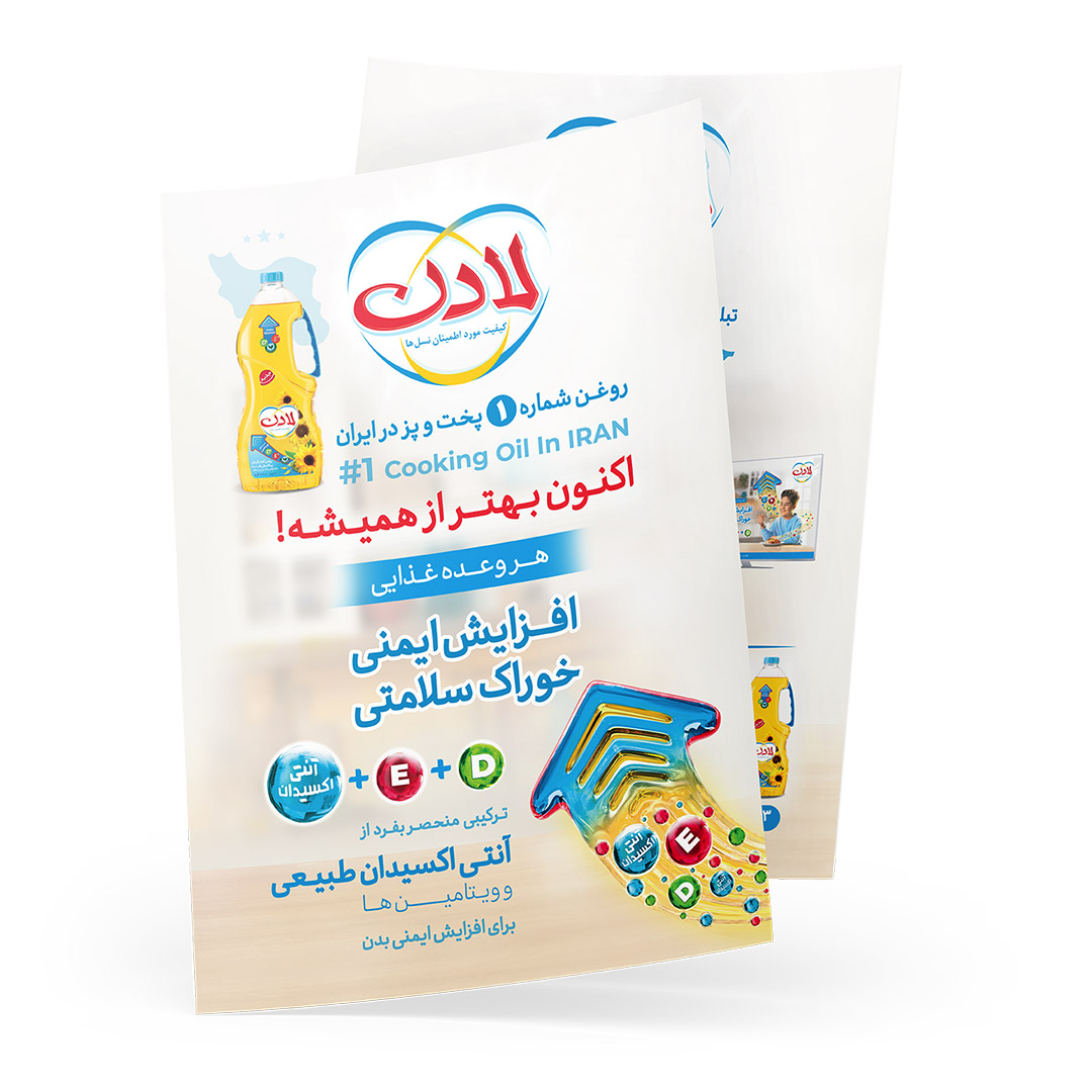
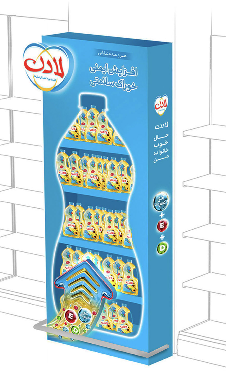
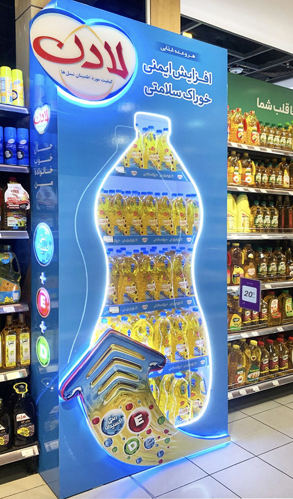
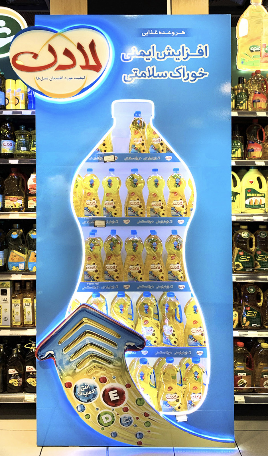
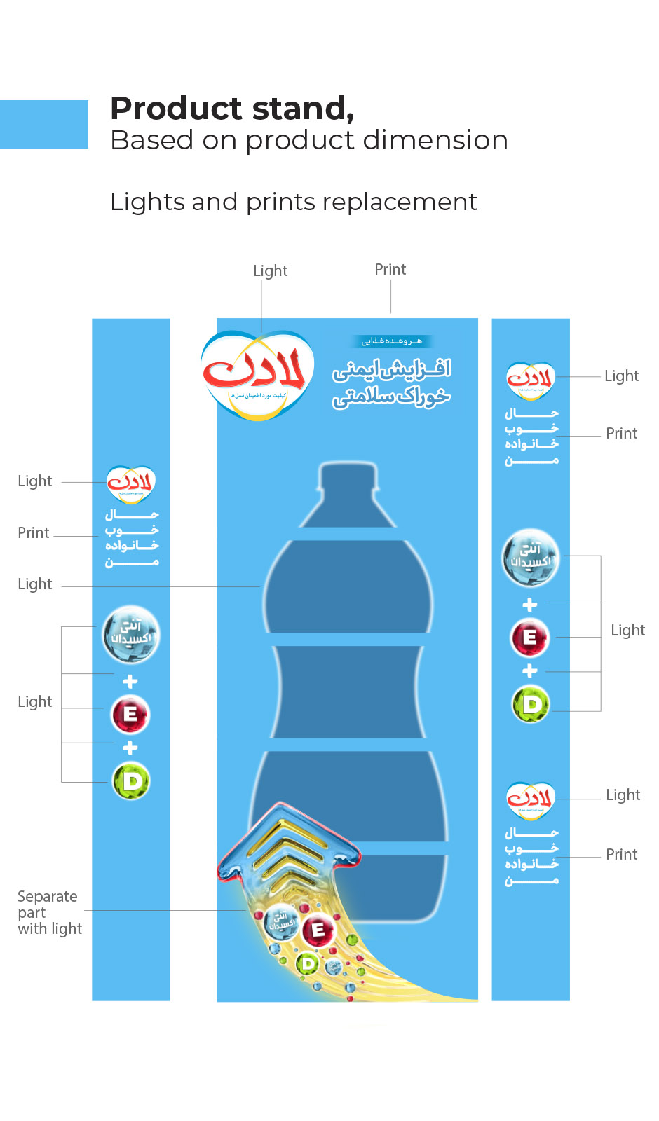
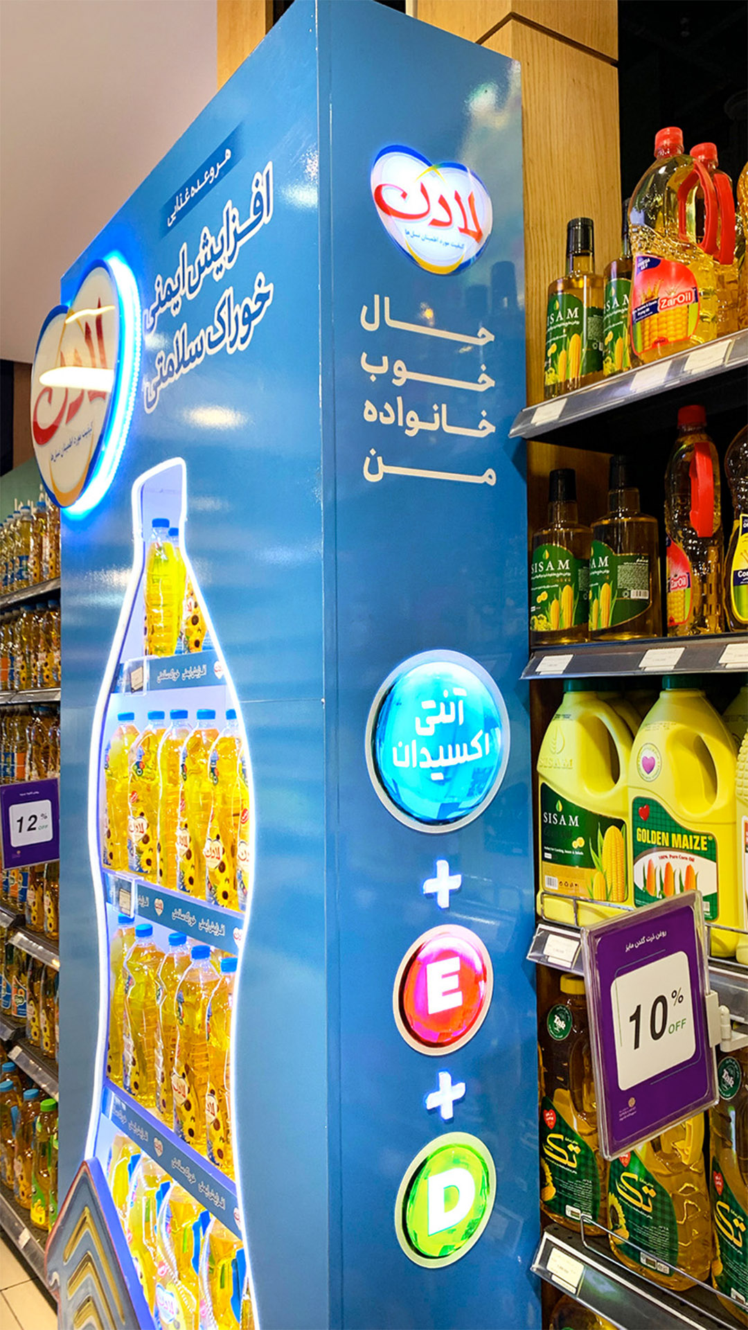
“Boost Immunity with every meal!”

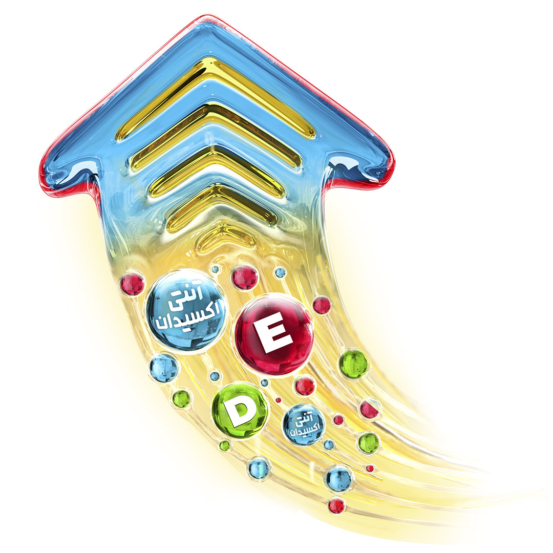
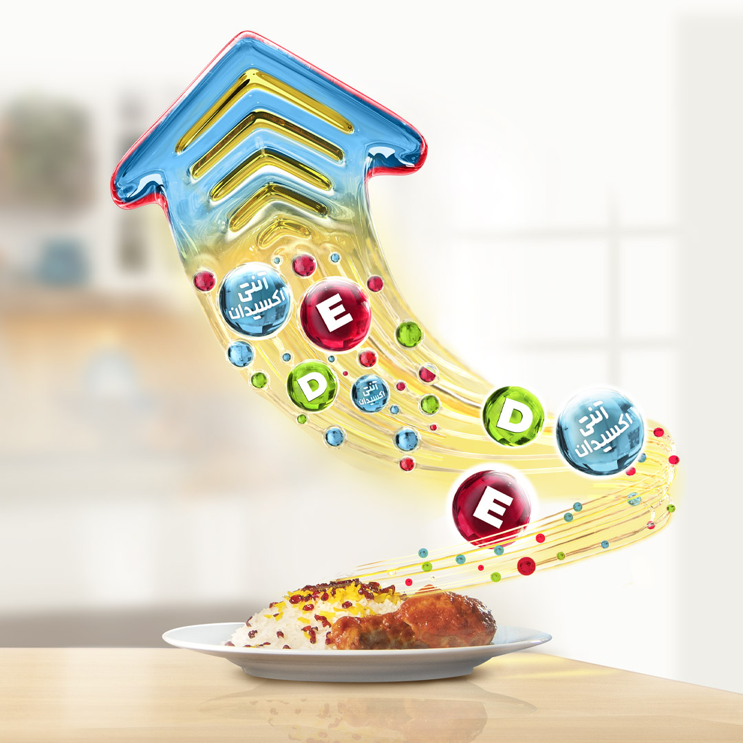
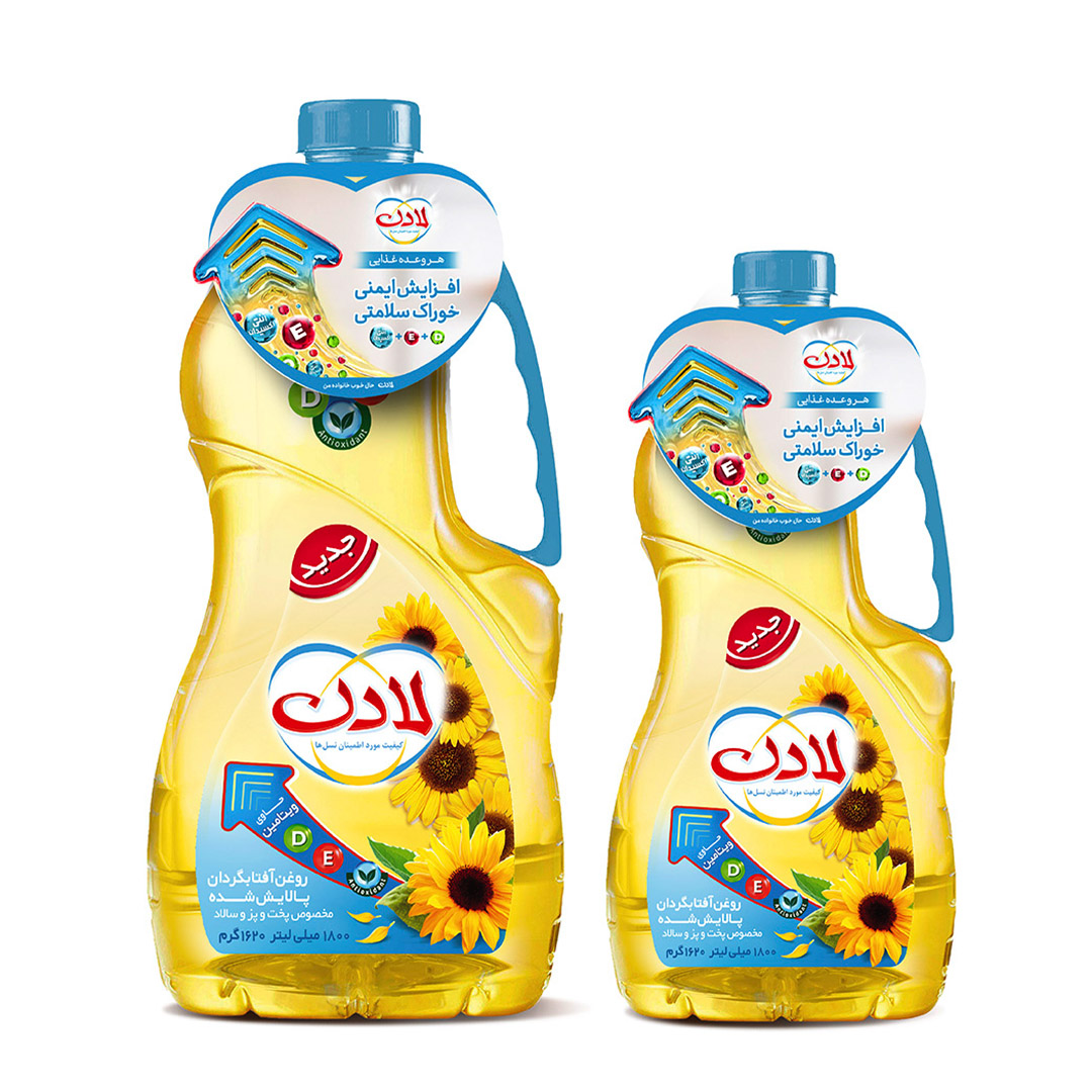
The launch project for Ladan’s new product, “Lifeoil” was developed based on the unique features of this oil. The inclusion of vitamins E and D, along with antioxidants in the new formulation, positioned Lifeoil as a distinctive and noteworthy choice among similar products.

Builing on these benefits, the capmaign’s call to action was crafted around the concept of “boosting the body’s immunity”, a promise directly linked to the vitamins within the product. In Persian, the expression “being the perfect fit for something”(literally “being its food”) conveys the idea of strong suitability.
Accordingly, the call to action “With every meal, boosted immunity-the perfect food your health!” was created. This CTA carries a clever double meaning: it communicates both idea of a healthy meal made with this oil, and the suitability of the product for enhancing overall wellness.

Project Date: May – June 2023

Location: Iran / Tehran

Client: Behshahr Industrial / Ladan Oil

Art Direction & Design: Sogol Majidi

Copywriting: Sogol Majidi

Photographer: Masoud Ghadiri

Senior Brand Manager: Nazanin Vanak

Discipline: Advertising

The Arrow

Visually, the campaign centered on a glossy, oil-like upward arrow designed to evoke the sense of boosting immunity and strengthening health. The ascending motion of the arrow symbolized the rise in immunity with every meal prepared using lifeoil.

A joyful child enjoying a meal cooked with this oil was featured to amplify the feeling of mouthwatering appeal and deliciousness associated with food prepared with the new Ladan product.
The image of the food plate and the product feature arrow were also considered in some items, without the child.

Across all campaign items-including wobblers, shelf talkers, product stands and islands-the glossy, transparent upward arrow served as the central visual element, ensuring consistency of the message and call to action across all touchpoints.
The image of the food plate and the product feature arrow were also considered in some items, without the child.

Neck Hangers

Wobbler

Head Gondola

Extended Head Gondola

Technical File

Islands

Shelf Talkers

For the product stand designed specifically for Palladium Supermarket- inspired by the shape of the new packaging-the addition of the upward arrow helped maintain alignment with the core campaign call to action. Furthermore, the use of lighting on selected parts of the stand enhanced its sense of purity, transparency, and oil-like shine, creating a more striking and refined visual presence.

Palladium Supermarket Product Stand